The Waverley Tartan Cloth Commonplace Notebook: Beautiful, but oddly ruled

I love plaid.

I don’t know if it’s because of my ten years of Catholic school — or perhaps in spite of it — but the colorful, patterned cloth has appealed to me for as long as I can remember. Perhaps none have been present in my wardrobe more than Black Watch plaid — a simple, understated green and blue plaid with roots in Scottish military garb born out of the unsuccessful Jacobite rebellion in the early eighteenth century.

I had a Pendleton wool scarf, which I cherished, and, in my late teens and early 20s, even a wool sweater vest!

Ladies.

Thats why, when I first became aware of Waverley’s tartan cloth-bound collection of journals from my friend Gary Varner’s blog, I was instantly lovestruck.

Continue reading

Rite in the Rain Notepad Paper Review

It’s been a long time since I’ve last posted a video review. But this one just begged for it:

Basically, I took the review page from my Rite in the Rain mechanical pencil review, and a page from one of my favorite notepads, the Ampad Retro Gold Fibre (available online or at Staples), and gave them a good soaking from the hose. Right away, the Ampad paper soaked up the water, became limp, and tore very easily.

The rather more hydrophobic Rite in the Rain paper resisted the water, which beaded up on the surface of the paper. It took just as much effort to tear it as it does a dry piece of paper (even dry, Rite in the Rain is thicker and offers more resistance than most writing pad papers).

I wrote on both sheets of paper with pencil, which is already water resistant. But if you use a fountain pen, especially with normal, water-soluble ink, the Rite in the Rain paper shouldn’t completely protect you from smearing when wet. Since the ink has soaked into the paper somewhat, it should perform better than the regular notebook paper, but still — I like to think pencil performs best under wet circumstances. Especially on a Rite in the Rain notepad.

Thanks to my lovely partner, Katie, for running the camera and the garden hose!

Pocket Department Notebooks, reviewed

I’ve been spending a LOT of time thinking about paper, folks. But sadly very little time actually writing about it. It seems like no matter how many different brands I try out, Field Notes always takes the lead. Whether that’s because of their gigantic fanbase or because of their creative limited edition notebooks, I don’t know, but my papery rabbit holes always seem to lead back there.

That’s why it’s a breath of fresh air to talk about a couple other pocket notebooks I’ve been using lately, by the Princeton Architectural Press. Through a collaboration with the Brooklyn Art Library, this collection, “Pocket Department,” has a unique format. From their website:

Pocket Department is a line of sturdy notebooks inspired by vintage stationery and designed to fit every pocket: back pocket, shirt pocket, backpack, and messenger bag. These custom-tailored notebooks are ideal for capturing ideas, composing thoughts, making lists, or sketching on the go.

JetPens, a fantastic online shop with pens, pencils and paper galore, was kind enough to send me a couple varieties of the Pocket Department notebooks they stock: The Shirt Pocket notebook, in green, and The Back Pocket in yellow.

Pocket Department Notebooks

The Shirt Pocket

Pocket Department Shirt Pocket notebook

At a pretty standard 3.5” x 5.5”, The Shirt Pocket notebook is not sized significantly different than an aforementioned Field Notes cahier. It does indeed fit easily into a shirt pocket:

Pocket Department Shirt Pocket notebook in shirt pocket

I really like the design: the color, the simple font choice on the front and the plainness of the inside. I love that the lines on the paper match the green cover, and the paper itself is smooth. It takes anything from a pencil to a felt-tip fine liner perfectly (I didn’t try it with a fountain pen, I’m afraid).

Pocket Department Shirt Pocket notebook writing test

I have to admit, I’m not a huge fan of the binding. Instead of a saddle stitch like so many pocket notebooks do, they opted instead to make it perfect-bound. That results in a much cleaner spine and keeps it closed flat, but when you’re trying to write it in, it’s very tight and hard to hold open.

It seems like it’d be a great format to offer something Field Notes, Word., and other pocket notebook stationers don’t: perforated pages. I’d love to use this thing to scribble a note, and then tear out for later. Alas, it’s definitely not a perforated book.

The Shirt Pocket notebook is available in a pack of three for $12.50 at JetPens.

The Back Pocket

Pocket Department Back Pocket notebook cover

This was a fun one to review! At 4” x 4”, this perfectly square notebook is unlined, perfect for quick visual notes, a sketch, or just for writing words that can’t be contstrained to lines.

Pocket Department Back Pocket Notebook paper test

Oh, just so you know, I am the WORST at drawing. I should have given this to a more artistic friend to try out.

It has the same binding as the green notebook, but the size made all the difference — because there was more width to each page, it was much easier to hold open. I also appreciate the size in that I can flip the page up, like a reporter’s notepad, if I wanted to.

The Back Pocket notebook is available in a pack of three, also for $12.50 at JetPens.

Other Sizes

The Pocket Department has a couple other sizes that I’d love to try that isn’t unfortunately available at JetPens — There’s The Messenger Bag, sized at 8.5” x 5.5”, and The Backpack, at 6” x 6”. They’re not so much formatted for a pocket on a piece of clothing than a pocket for a bag, so they’re much bigger.

I found a website at PocketDept.com that seems to tease out different colors being available, like grey, white and a natural brown paper sack color, but the site is either broken or not entirely built yet.

All things considered, this is a fun little notebook series. I haven’t used it enough to tell how durable they are, but once I figure that out, I’ll definitely report back.

Find out more information about Pocket Department notebooks at JetPens.com.

The Gallery Leather Oporto Journal, reviewed

Prologue: Apparently Johnny Gamber and I are on a similar review circuit — he just posted a review yesterday! Be sure to check it out at Pencil Revolution for much better pictures.

Disclaimer: I received this product free of charge from Gallery Leather for review purposes.

There was a period of four or five years back in my pre-iPhone, post-collegiate days where I religiously used a weekly planner. In fact, I had a yearly ritual to usher in the new calendar year: After the first week of January, I’d go into Barnes & Noble or Borders, walk straight over the journal aisle, and page through the weekly planners.

It was an intensive process, and I had a whole list of requirements. In fact, back in 2007, I wrote it all out on 43 Folders:

  • Needs to be in the 5.5” x 8.5” range – slightly bigger or smaller is all right.
  • The week has to fit onto one page or one spread.
  • There cannot be markers on the day for hours. My day doesn’t start at 8 and end at 5, so don’t fence me in!
  • It has to have simple styling – one simple color or design. None of this “180 Great Views of Ireland’s Splendor” kinda stuff.
  • I need a bookmark or tabs to indicate where I am in the book, so I can easily turn to the right page.
  • No spiral-binding. Yes, I know that makes it lay flat easier, but I’m left handed. That binding hurts. Plus, I like to feel like what I’m writing in is a book.

And, almost every year, the winner of my exhaustive search was Gallery Leather.

That’s why I was so excited when I got an email from a representative from Gallery Leather asking me if I’d be interested in reviewing one of their products. I almost asked for a planner for old times sake, but I realized I couldn’t utilize it properly — I work at a job where we must use our electronic calendars, so I’ve sadly given up on my analog workflow.

The Gallery Leather Oporto Journal in orange

After poring through their product lineup, I set my eye on the gorgeous Oporto Journal line. The design is a bit more modern than the classic (though not stodgy) Gallery Leather styling, as you’d see in their desk journal or travel journal range. The edges are a bit more flush, the leather is bonded to the substrate, and the pages aren’t gold-edged.

In the grand tradition of Brad Dowdy when presented with a color conundrum, I chose an orange one.

Aesthetics

Closeup of the beautiful, supple leather cover on the Gallery Leather Oporto Journal. This close up, it looks like an orange, doesn't it?

Closeup of the beautiful, supple leather cover. This close up, it looks like an orange, doesn’t it?

Ah, it feel like I remember my planners to feel: Solid yet flexible in a way only leather can replicate, smooth and cool. I really like the A5 format for journals (imagine an 8.5” x 11” sheet of paper, folded lengthwise, and turned on its side). It fits really well in my hand and leaves plenty of room for writing without getting bulky. It’s perfect for writing in your lap or on a desk.

All of the ways I listed above where it differs from the traditional Gallery Leather I think work, really, really well to give it a refreshed, modern, more minimalist feel.

A closeup of where the leather cover meets the substrate. It looks a bit raw and unfinished.

A closeup of where the leather cover meets the substrate. It looks a bit raw and unfinished.

Except in one area: where the leather meets the substrate.

In the classic Gallery journals (and planners), the leather is folded neatly around the corners and sort of tucked around the back of the substrate, and under the paper liner. It gives the feeling of a neatly folded bed. With the Oporto, the leather is sheared off on the rounded corners, and the substrate/paper liner is glued to the back of it, about a quarter of an inch in. It’s a little hard to explain, so here’s a picture:

It feels a little bit weaker, and with time, I imagine the leather bending inward, wrinkling a little bit. I know that is essential to the modern styling, but it feels a little… unfinished.

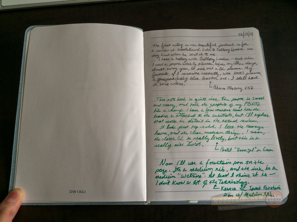
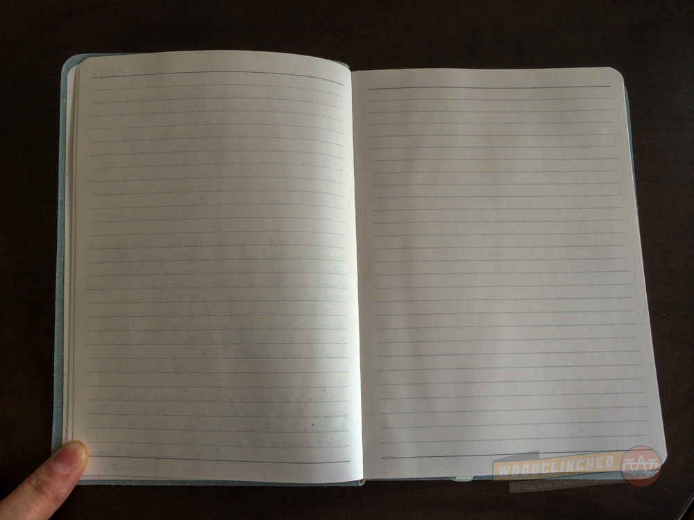
The paper is, with my other books from Gallery Leather, top notch. It’s much whiter than the creamy manilla pages of their classic journals, but not a jarring bright white. It’s definitely duller than, say, a Rhodia notepad white.

Performance

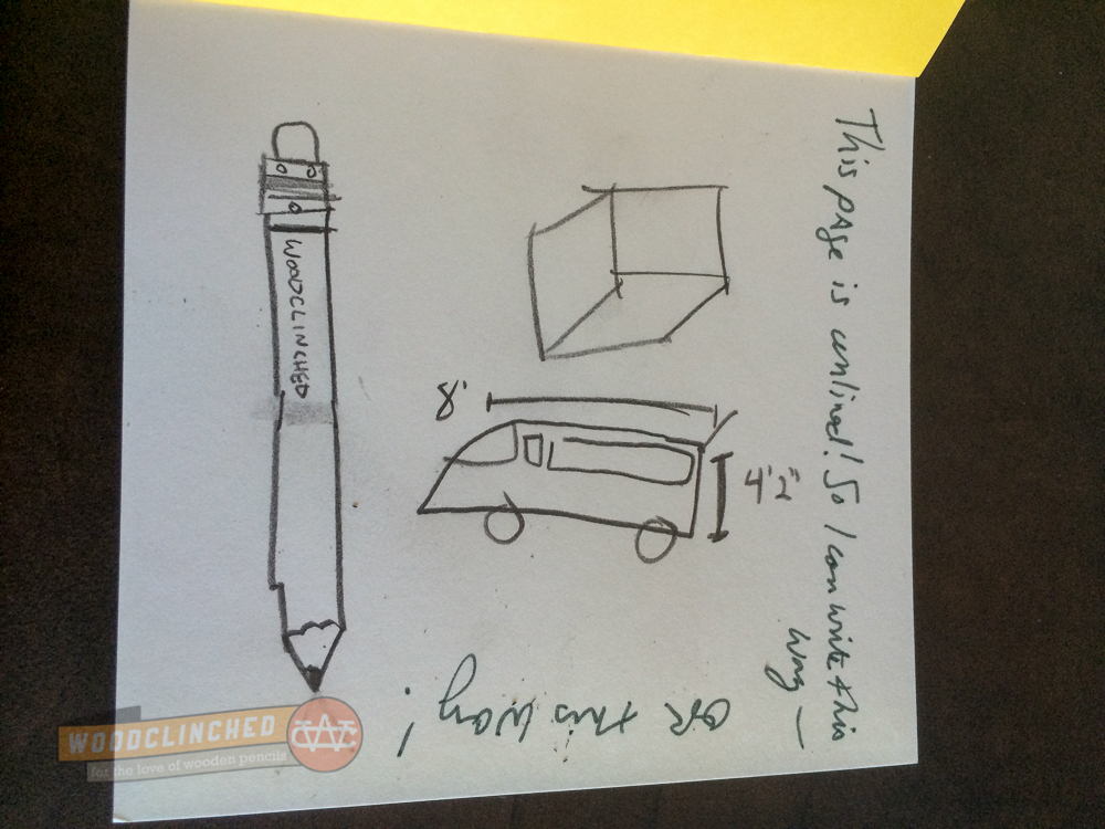
It performed just as I expected, which is to say superbly. I tested a page out with a pencil, my trusty Peebs 602. It took the graphite really well, with nary a smear after laying down the mark. For as smooth as it seemed, there must have been some kind of tooth to the fiber.

Gallery Leather Oporto Journal page spread

To be fair to my inky friends, I also used a green gel pen that I found on my desk, and a gorgeous Kaweco AL Sport with a medium nib, laying down green ink from a cartridge I loaded into it.

The page was plenty thirsty, and barely smudged when I passed my finger over marks that have been created just a second or two before. Looking over on the other side of the page, I could see that there was just barely a bleed-through with the fountain pen, and absolutely nothing showing for the pencil or the gel pen:

Gallery Leather Oporto Journal opposite page spread — barely any bleedthrough

Finally, holistically, the journal fared really well. I carried it around in my messenger bag for three weeks or so. While there aren’t really any loose sharp objects jostling around with it, my laptop charing cable, other books and notebooks, and some paper was in there with it. To this day, the journal looks brand new.

Wrapping Up

This journal is a treat to use. Gallery Leather flies under the radar a lot of times, with their understated marketing (the opposite, perhaps, of Moleskine) and their lack of gimmicky features (cough cough Baron Fig cough cough) You’ll see them for sale at Barnes & Noble, or right at their very own website.

The Oporto journal is very reasonably priced, in my opinion, at $20. As of June 26, it looks like they have a full stock of all colors except for black, which will be available again on July 25.

Gallery Leather Oporto Journal

Check out some more pictures I took of this book.

New Field Notes edition: Arts & Sciences

I don’t know exactly when the quarterly Field Notes COLORS edition was something I anticipated and looked forward to every three months. It may have been when they started making little “making of” videos for each style. Or maybe it was the tremendously unique Shelterwood edition. Or maybe it was this one, when they started teasing the hell out of it. (Have you seen this series of videos, for example?)

But I have started looking forward to it, as I might with a new Apple announcement event or the release of a new episode of Adventure Time. Just last night, in fact, I had a dream that the new Field Notes edition was edible — that its cover and pages were made of a paper-thin graham cracker-like cookie. That’d pretty fantastic, but they definitely wouldn’t last very long. And I bet the graphite markings I’d make all over it would not be tasty.

That’s why I was relieved  for what they did announce:

The Arts & Sciences edition!

FN23AS8sm

At 7.5″ x 4.75″, it’s a bit bigger than the standard Field Notes cahier:

FN23AS9sm

And the layouts feature one blank page and one with the specialized layout (lined for “Arts”, presumably for writing that great American novel or poetry, and a 5×5 grid for the “Sciences” book, for, uh, charting the stars or something?)

While this doesn’t set me on fire, I think it’s a good, solid edition. I can definitely find use for the larger size and the grid paper.

FN23AS5sm

Also, I love these buttons!

FN23AS6sm

They’re selling for $9.95 for the two notebooks over at FieldNotesBrand.com. And, of course, you can get a subscription for about $100 a year, which includes two packs of each quarterly edition, and some other goodies.

Shout-out to Johnny from Pencil Revolution for correctly surmising the edition from the teaser videos over in the Field Nuts Facebook group! You, sir, are a visionary.

All photos from FieldNotesBrand.com.