Premium Palomino Blackwing-branded notebooks

Note of disclosure: I am no longer employed by California Cedar Products or Pencils.com — though I am still their biggest fan

If you follow Pencils.com on Twitter (@pencilscom), you may have seen this tweet hit the webbernets:
Although I’ve known this was coming for a while, I have no idea what they’re going to look like or when, exactly, they’ll be hitting the virtual stands. But I know I’ll be wanting one or a few with my last, dying breath.

The Gold Fibre Ampad writing pad with antique ivory pages. Great quality paper, lined front/checked back, and all around old-timey fun!

So that’s pretty exciting. I’m still loving my Palomino Blackwing 602s, and I’ve been wanting something nice upon which to write with it. My usual meeting note-taking paper tablet is this retro-rific Gold Fibre pad by Ampad (or its 8.5×11″ counterpart), but it’s not the most formal thing you’ll ever see, you know? And although I have several pad-folios, they take up a lot of room, room in my bag that competes for space with my laptop, charging cord, various pencil and pen wraps and other things that I’ve collected via my borderline hoarder tendencies.

Speaking of Palomino Blackwing branding, I love the new packaging for the Palomino and Blackwing brands, don’t you? Charles sent me this the romance shot the other day (click to embiggen the pencil geekery goodness):

The graphite drawings on the Palomino graphites are stunning, and I love the vivacity of the colored pencil line. (I assume this photo was taking by the very talented Sue Tallon, a still-life photographer who Pencils.com uses for stellar product shots.)

I’ll let you know when the notebooks are released, and I may even have a review up here!

Meanwhile, what pencils and paper products have you been using lately?

Gridbooks: bring digital and analog together

Sometimes when you’re creating something as physically intangible as a website, you need to be able to piece it out longhand. Paper and pencil (or pen) gives you a chance to run your hands along the lines of the elements, feel the length and width under your fingertips, and give yourself time to conceptualize it.

The good folks at Gridbooks recently sent me some samples of their product to try out. They produce really good quality notebooks with flexible grids for ad design and webpage layouts.

I was excited, though I quickly realized that since I’m not a web developer, I couldn’t fully utilize their intricate grid. I needed a better, more experienced opinion.

I handed the samples over to my friend Josh Tuck, a talented web designer and food blogger at The Quest for Zest, a great high-class local food blog. He produces some of the best, boldest, simplest grids I’ve seen. And since he’s the one from whom I learned about Gridbooks in the first place, I knew he’d be interested in giving them a try.

Josh says:

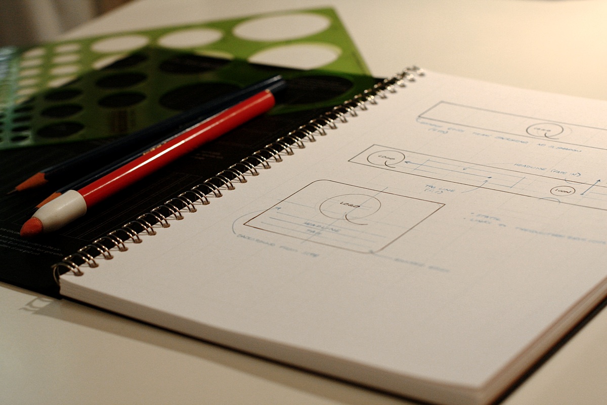
When I was in college, print design on computers was just beginning to crawl out of its infancy into toddlerhood. Our school couldn’t afford speedy new Mac 9500s, so we learned paste up with actual paste instead of “cmnd+v”. I carried this pencil-and-pad approach to laying out ads into my career in advertising. I noticed that when I sketched ideas, for ads or websites, the final result was always better then when I started designing on the Mac.

So, from an old-school designer’s point of view, Gridbooks are spectacular. Halfway through testing – with markers, pencils, and circle templates scattered on my desk – I wondered, “Why the hell wasn’t there something like this years ago?” They give you just enough guidance to make concepting easier without getting in the way of the creation process. They are surprisingly versatile, effortlessly usable, and beautifully minimalistic.

That beauty is only “so” nice though, and I like that. As any proper pen and pad snob will eventually confess; if the product is too nice, it risks never being used. I have a stack of sketchbooks and a mug of like-new pens because I am terrified I will ruin them by scrawling something unworthy of their perfectly designed form. Not so with Gridbooks. While they are attractive enough for any designer to carry into a brainstorming session they aren’t so good looking that they will never get used.

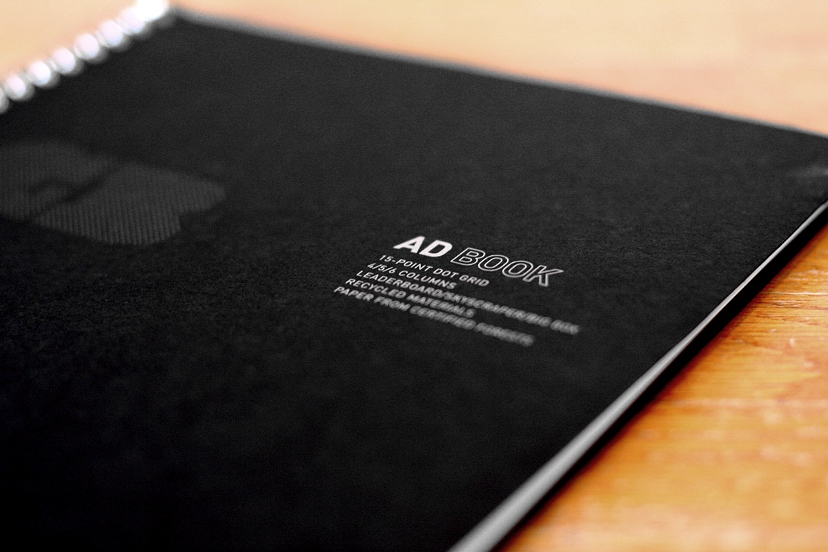
The cover of the Ad Book is a toothy 80 lbs. cover stock. It’s folded over on itself for added weight and it’s discretely printed in silver ink. The paper for the interior pages is an 80 lbs. text weight with just the right finish for pencil or pen. The grid lines and dots are just visible and all but disappear under your sketching; a feature I wish I could get from a certain Milan-based notebook company whose products I covet more then my next breath.

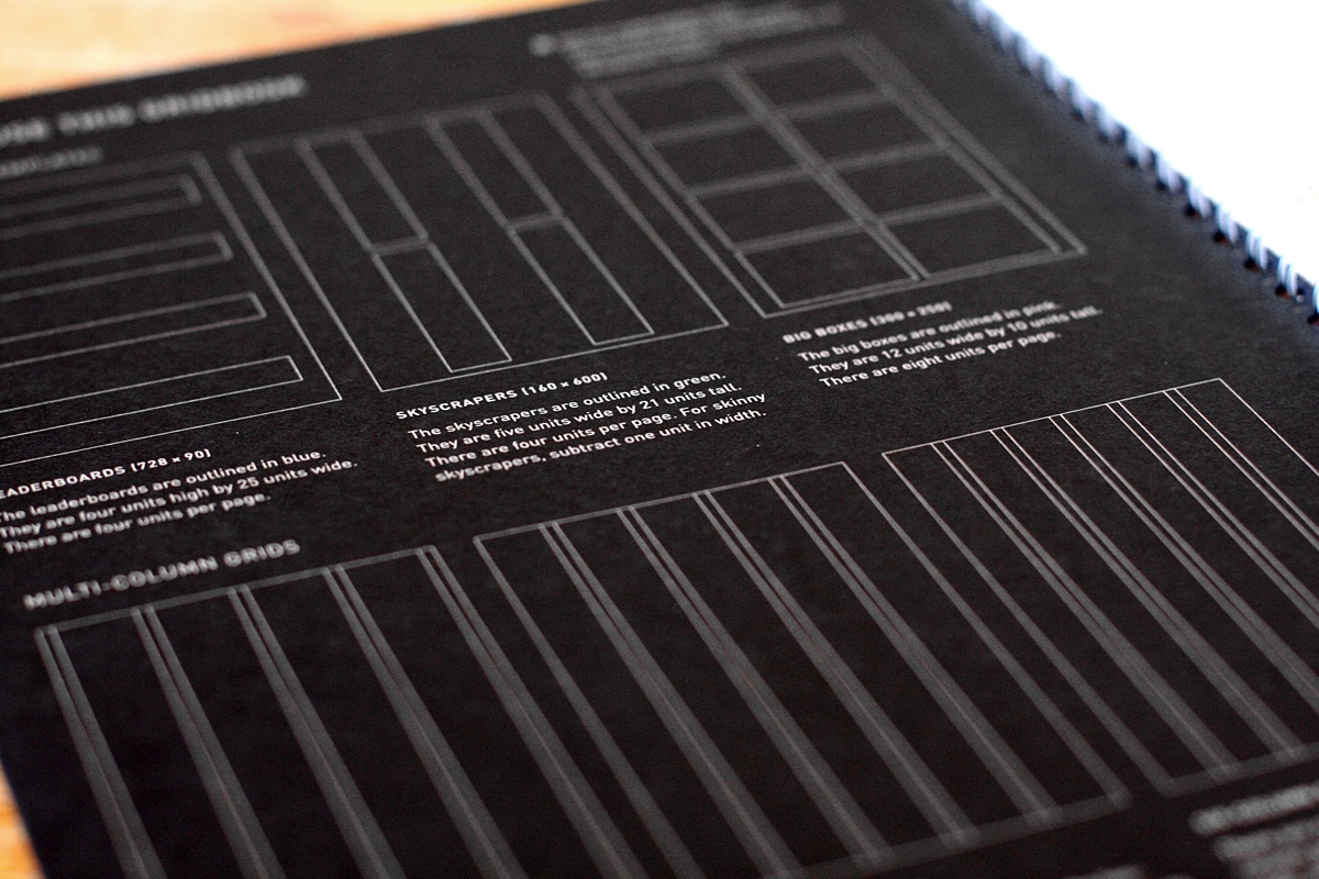
Gridbooks also use an ingenious technique of overlaying many grids on the same sheet. All the key ones are there; banner ads, skyscrapers, and big boxes. Each one is color coded for easy identifying and they are all pixel accurate. The same is true of the web layout pad with it’s 960 pixel 8, 12, and 16 column grids in addition to 3, 4, 5, and 6 column grids.

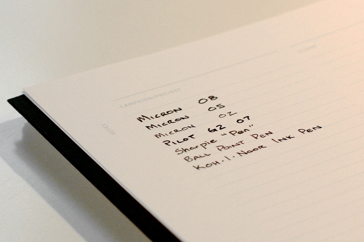
I tried a variety of pens and was pleased to find that they did not lose their edge or bleed through the page. You can truly use both sides of the sheet without fear of blotting up past ideas.

Gridbooks are worth every dime of the purchase price. I firmly believe that sketching is still superior to jumping straight into Photoshop, Fireworks, or even Balsamic. Sketching forces you to focus on the big picture and not get bogged down in the details and Gridbooks make that process faster and more painless then ever.

All photos by Josh Tuck. (In fact, these are the best photographs this blog has ever seen! I need Josh to take all my pictures.

Image Gallery:

Ask Woodclinched: The perfect, minimized desk

A letter came in from one of my many, many adoring fans:

Dear Woodclinched,

My lease is up at the end of the year, and I’m looking to create the perfect office. I can handle the desk, the artwork, and the liquor cart but I’m a little stuck when it comes to my writing utensils and accessories.

Here’s the problem: I have a hard time focusing on getting stuff done. If I know there’s a pencil or notepad I want to use and it’s not right in front of me, I can’t get anything done.

So… If I’m going to outfit my office with one type of pencil, one pen and one notepad/notebook… what do you recommend?

Thanks!

Alex Jonathan
http://www.expeditiousculture.com

A nice, clean desk, via iDesk, a great Tumblr about Apple-accessorized desks and offices. Yes, I know that I am an Apple fanboy.

Excellent question, Alex! I completely understand your quest. I’ve been trying for years to minimize my desk. I am, by nature, a cluttered person. As much as I strive for a “less is more” mantra, I have realized that more often than not, I’m going to trend to “more is more”.

That being said, I have learned to pair things down to a few essentials. And when it comes to my writing paraphernalia, I’ve thought a lot about it. More than most sane people should. Read on for an exhaustive list. Continue reading

Moleskine Pac-Man Edition

Boy, for a pencil blog, I sure do cover paper a lot. But what, after all, is a pencil without paper to write on? It’s just a stick of wood.

Besides Rhodia and Field Notes, one of my favorite things to write on is a Moleskine notebook. Like John at Pencil Revolution, I get a little suspicious of some of the claims Moleskine makes about being the preferred notebook of literary and artistic figures throughout the centuries. However, like John, I still use them. Until recently when I switched to iCal, I was using a really great weekly planner and notebook made by Moleskine. Their pages aren’t as creamy as Rhodia, but they are thick, sturdy, and hold graphite markings as well as drink up fountain pen ink like a pro.

That’s why I was excited to see this:

To celebrate the 30th anniversary of the video-game Pac-Man, Moleskine has released a 5-piece edition, featuring featuring “pocket and large hard cover notebooks, both plain and ruled, and a colorful set of 4 large Volant soft cover notebooks in celebrative packaging.” Each notebook has beautiful 8-bit cover art from the video game and mini-stickers. How fun is that?

It looks like you can buy them here, or “other online and offline bookstores worldwide,” according to Moleskine.com.

Orange fever: The classic Rhodia notepad

NOTE: This post originally appeared at the now-defunt PencilThings blog on July 9, 2007. See it, sans CSS or images, at the Internet Archive here.


I first discovered this wonderful little orange notebook back in 2003 when I was watching one of my favorite shows, Good Eats. The host, Alton Brown, was writing a grocery list on a Rhodia notepad. It didn’t process with me, until a year later when I attended college at Indiana University in Bloomington, IN. There is a great little store there called T.I.S. that sells textbooks, college apparel, and office supplies. Yes, office supplies! A veritable plethora of pens, pencils, and paper.

One shelf had a shoddy little orange display. Though it was in disrepair, the orange-ness and the stylized European look lent itself to hipness and—what immediately attracts me to almost any consumer product—cult following. That episode of Good Eats sprung into my mind, and I realized: if my hero Alton Brown has one, by gum—I need one too.

Fallacious though my reasoning was, it was one of the best purchases I ever made. Yeah, it is cool looking. (Aesthetics count for a lot, just read some of my pencil reviews.) The bright orange and the crisp black  go so well together, you don’t even think of a Halloween theme. Immediately upon opening the cover, you know you’ve reached notepad nirvana. The satin-finished paper is think, luscious, and smooth. If writing on a standard notepad is like driving down the street, writing on Rhodia paper is like cruising in your hovercraft across a giant swimming pool. On a calm day. Take a look at the paper:

Isn’t that nice? (The image is not mine.)

Notice that both pictures feature graph paper in their notebooks. Chill out, man, that’s the way the Europeans do it. I personally like it. That way, you can write with the notebook turned portrait or landscape. For your American purists out there, they do come in lined versions.

I can even tell you what my favorite size is—the 3″ x 8.25″. It is extremely long and skinny and fits in the palm of your hand really well. Perfect for making lists and, if you are a reporter, taking notes on the go. I spent some time working for a newspaper and this was my best friend.

Unfortunately, yes—Rhodia is expensive. An 8.5″x11″ pad with 80 sheets will cost you about $9, as opposed to less than a dollar you might spend on a Mead notebook from Target. But it is worth it. Trust me.

Find Rhodia notepads at Pencil Things and many other fine stationary retailers. Also, one of my favorite blogs, Rhodia Drive, is devoted to their full line of products.

Overall rating: 4.5 out of 5 points.


UPDATE 09/27/10: I’ve been using Rhodia notepads every day since then. Often when I review a pencil, it provides a white background on which I base the blackness of the graphite. I have discovered, as John from Pencil Revolution mentions in his review of Field Notes, that for some pencils, the creamy, smooth paper of Exaclair products sometimes doesn’t “catch” the graphite as well as something more fibrous, like Field Notes. But for high-end pencils and—gasp—ink pens, Rhodia is king in smoothness, bleedlessness (which I’m pretty sure isn’t a word), and quality.