Refreshed product lineup at Pencils.com


product_lineup

DISCLAIMER: Okay, so it’s been two years since I’ve worked at Pencils.com, so at some point, I should stop disclaiming myself. But, I worked there in early 2011. I am no longer paid or affiliated with Pencils.com in any official capacity. They sent me the products you see above for free, but they do not compensate me financially in any way.

There have been some seemingly subtle changes going on in the Pencils.com store recently. But they are important to note.

The lineup

First, they’ve eliminated the “California Republic Stationers” brand and rolled the Golden Bear and the Prospector into the “Palomino” brand. So, like the Palomino Blackwing, they now have the Palomino Golden Bear and the Palomino Prospector.

A Palomino Golden Bear next to the old California Republic Golden Bear

A Palomino Golden Bear next to the old California Republic Golden Bear. I appreciate that they don’t come factory sharpened now.

I think this was a wise choice. The California Republic brand for CalCedar’s pencils was pretty weak. No one really identified their pencils with that name. The Palomino, one of my favorite pencils in existence, is a much stronger brand, and made much stronger by the visibility of the new Blackwings being wrapped into their brand.

That, along with the new packaging, really showcases the brand of these pencils.

Secondly, no longer are these pencils made in Taiwan Thailand (Thanks, Charles!) — they’re manufactured right here in the US of A, at the Musgrave Pencil Company in Shelbyville, Tennessee. (Warning: their website is atrocious, in sort of an awesome way.) And even with this radical change in supply line and vendors, the price has not increased (or, admittedly, decreased)!

The biggest change — which is tragic to me — is that the triangular Golden Bears were discontinued. I love triangular pencils, and I really loved these. According to Charles Berolzheimer, the Pencils.com President and CEO, Musgrave just doesn’t have the tooling capability to make the triangular barrels.

I’m glad that I have a whole bunch of them left, though I usually give them out when I explain to someone about fancy pencils. I may have to be a bit more miserly about them now.

Charles also tells me the oft-overlooked child-focused Spangle will be discontinued, too, as they sell through their current stock. While I have a few of them, I haven’t used them enough to really form a coherent opinion on them.

Coming later this year, Pencils.com will have some changes in the orange tipped and untipped Palominos, too. Hopefully I’ll be able to tell you more about them when I get to try them!

Differences in appearance and experience

First, the new USA-produced Golden Bears and Prospectors are noticeably heavier than the old ones. I need to get my hands on a digital scale to tell you how much heavier they are, but it’s not a burdensome heaviness — it feels more substantial, like it’s a fancy hardwood in the barrel.

The ridges of the hex shape are ever so slightly sharper, too, so you can feel the hexagonal shape. They’re not so sharp that they’d hurt your finger while you grip it, but you can definitely pick out every plane of the barrel. They’re not rounded edges like the old-style pencil.

There are some subtle changes in labeling besides the brand change. Instead of a “HB” label indicating the more classic European graphite hardness scale, there’s a “2”. From a marketing perspective, I understand why they did this. If someone was buying pencils for a standardized test, which explicitly say to use “#2” pencils, a typical American may be wary of a pencil that says “HB”.

The blue Golden Bear (with orange eraser) changed in fairly subtle ways. Instead of a blue stripe on the ferrule, there’s a red stripe.

The Palomino Prospector Pencil, top, compared to the California Republic Stationer's Prospector, below. Both from Pencils.com. Apologies for the light wash in this image.

The Palomino Prospector Pencil, top, compared to the California Republic Stationer’s Prospector, below. Both from Pencils.com. Apologies for the light wash in this image.

Differences in performance

Both Golden Bears and the Prospectors pencils by Pencils.com were put through a performance test.

Both Golden Bears and the Prospectors pencils by Pencils.com were put through a performance test. Click to embiggen. (Also, please pretend that said THAILAND, not TAIWAN. That was a factual error on my part.

I alternated use of each pencil on-and-off for about a week. I can tell you that I noticed no difference in performance in the Golden Bears, good or bad. To me, that’s a good thing — I really like the way they write. (I’d compare them to a Dixon Ticonderoga, but with the tactile feel closer to a Palomino.)

I’ve never been a huge fan of the way the Prospectors write, but at $2.25 for a dozen, they’re definitely worth the price. Both Prospectors are a bit scratchier than a Golden Bear, though the new one was the TINIEST bit smoother.

The erasers, which look and feel identical on both Golden Bears, performs identically. (I didn’t have my red Golden Bears with blue erasers when doing this eraser test, so just the erasers on the blue Golden Bear and the Prospectors were used.)

The Prospector was a different story. The new erasers feel a bit more vinyl than the grainy Taiwan Thailand-made Prospector. It erased better, too, if you notice in the photo above.

And in conclusion…

Before, I used my Palomino Blackwing (602) and my Palomino Proper almost exclusively, though I had a few triangular Golden Bears at work for quick notes. I think I may need to add these new blue Golden Bears to my rotation, though — it’s just a gorgeous pencil, full of color and personality, and now it feels better in my hand. I’m excited that the Palomino line is going to be made in the US, and for the same price as before.

The linkage

Review of the Pencils.com Palomino-branded hardcover notebook


About a month ago, Alex from Pencils.com was kind enough to send me a box of new paper products Pencils.com is selling — I wrote about them on this blog previously.

It’s been a month, and I’ve been using a few of those products pretty thoroughly. My very favorite is the hardcover Palomino Luxury Notebook, sized medium.

A contemporary of the Moleskine and its kin, I lament the passing of Black Cover, the blog in search of “the perfect little black notebook” that gained so much momentum in its fairly brief existence and its even briefer re-appearance early this year. Nick, the blogger, is a tremendous reviewer — I wonder if he ever got one to try!

In order to appreciate these little hardcover notebooks, you have to embrace the subtle differences. Relatively speaking, almost all of the $15-$20 5×8″ notebooks are generally the same quality, serve generally the same function, and are styled generally the same. I’ll try to highlight the differences here, as I see them:

Style and Features
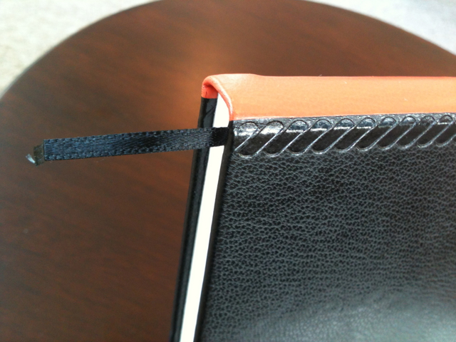
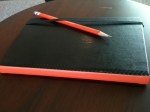
The Palomino Notebook’s most obvious, and to me, the best difference between it and others is the orange stripe that runs along the spine. I love orange, and I especially love Palomino Orange (and Golden Bear orange). When I’m using one of those pencils, it makes a great match. When I’m not using one of those pencils, it still looks great on its own. What a difference a splash of color makes!

I love the orange spine on this notebook.

The little stitched pattern on the sides are nice, too — I’m not sure if it is a tribute to something, or is a style all its own, but it gives it the look of an old, hand-sewn Italian stitch.

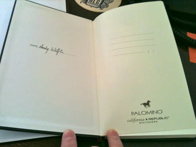
Like a Moleskine it has a cover page spread where you can put your name and contact information in case you lose it. It’s on a really lovely heavyweight paper that just drinks in your ink (Yes, I used a pen to put my name on this page, since it should be permanent) and doesn’t bleed through.

Also like a Moleskine, it has a pocket in the back! It’s made out of what looks like folded-over tear-proof paper, so you can put some stuff back there (sometime I hoard cash in it, but don’t spread that around) without tear.

One feature lament: I really, really like gridded pages. I’d love to see a Palomino notebook sporting that option, besides the lined or plain pages currently offered.

Quality
It is of superb quality. It has more of a hardcover book-like binding the Moleskine, and though it’s a bit stiffer when I lay it out on a tabletop, it’s getting better, and I don’t feel like I’m pulling the paper out while doing it.

The paper itself is nice. In a discussion with John at PencilWrap.com, he mentioned that the paper was really smooth. Agreed. (Also, go check out his review of the “flex notebook” cahiers, because he took way better pictures than I did, and compared them side-by-side to the Moleskines!)

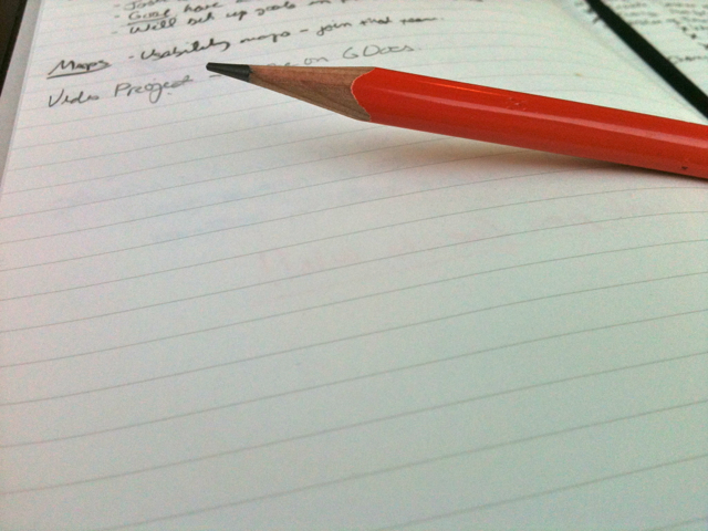
Though it’s very smooth, I felt like it had a bit of tooth, since it’s supposedly optimized for a pencil. A pleasure to write on, at least with a Palomino Blackwing 602, a Dixon Ticonderoga, and a Golden Bear, all three of which I’ve had with me this week.

I also think that the cover of the Palomino is better. It’s a bit more leathery, a bit more supple, and does not bubble up like some of my Moleskines have been known to do.

If, say, the Moleskine was the standard of which people use hardcover notebooks, and if we set that value at 10, I’d give the Palomino notebook a solid 13. It’s a great price, at $17.95, exactly the same as a Moleskine. Admittedly, Moleskine has a better variety of pages (they have formats for storyboarding, music composition, etc.), and currently offers a special Star Wars collection, which would clinch me right there if I was actively in the market for a notebook.

However, I love the California Republic brand, and the Palomino line, so I’m excited to have a notebook in this brand, too.

Coming soon(ish): Thoughts and photos of some of the other notebooks!

Disclaimer: As I’ve written before, I am formerly an employee of Pencils.com. I no longer work there or receive any money from them, so this review is not being funded by them. This product was sent to me free, however.

Gallery of Images
(Click to embiggen) 

The Classroom Friendly Pencil Sharpener

For as many different kinds of wooden pencils I use, I’m not usually too adventurous with my pencil sharpener. I usually exclusively prefer hand-held sharpeners, like my left-handed sharpener, my Palomino KUM Long-point sharpener, and the KUM Ellipse I keep in my jacket pocket almost all the time.

I remember with disdain the giant Cold War-era Boston sharpener of yore that would hungrily eat my pencil with its two giant dull grinders. It left me with a long, dull tip and the wood surrounding it half-eaten and dirty. Sure, it didn’t take as long to sharpen with that monstrocity, but it was loud, messy, and ineffective.

This summer, I got an email from Troy Decoff, who developed what he calls the “Classroom Friendly Pencil Sharpener“. It seemed to combine the heavy-duty nature of the wall-mounted sharpener with a smaller footprint and sharper grinders.

It operates very similarly to the Dahle Fifty-50, which I’ve reviewed on this site just over a year ago. Pull out the front, pinch the holders together, put your pencil in, and start cranking.

The benefits of this sharpener over the Dahle? Well, first, the pencil holder locks into place when it’s fully extended, unlike the Dahle, and it’s sturdier, with an all-metal case. And, most importantly, the point is much much longer.

Look how sharp! Buffy the Vampire Slayer would appreciate this sharpener.

While the point is not quite as long with the Palomino KUM Long-point Sharpener, it’s still very long. And very sharp. If the two-step manual process of the Palomino sharpener is too hard, this will be much easier.

One disadvantage is that, much like the Dahle, the grippers will leave a mark on the barrel of the pencil. If you’re just using, say, a Ticonderoga, it’s no biggie, but I don’t want to ruin the nice sheen on my Blackwing or my Hi-Uni!

I’ve brought it to work and keep it at my desk. It’s perfect because it’s quiet enough to not disturb my office-mates, and it’s quick enough to re-sharpen a dull pencil in less than 10 seconds.

Thanks, Troy, for making such a great product! I like this much better than most of the desktop electric sharpeners you see at office supply stores nowadays.

The Classroom Friendly Pencil Sharpener | $19.95 from Classroom Friendly Supplies.com

Gridbooks: bring digital and analog together

Sometimes when you’re creating something as physically intangible as a website, you need to be able to piece it out longhand. Paper and pencil (or pen) gives you a chance to run your hands along the lines of the elements, feel the length and width under your fingertips, and give yourself time to conceptualize it.

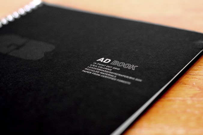
The good folks at Gridbooks recently sent me some samples of their product to try out. They produce really good quality notebooks with flexible grids for ad design and webpage layouts.

I was excited, though I quickly realized that since I’m not a web developer, I couldn’t fully utilize their intricate grid. I needed a better, more experienced opinion.

I handed the samples over to my friend Josh Tuck, a talented web designer and food blogger at The Quest for Zest, a great high-class local food blog. He produces some of the best, boldest, simplest grids I’ve seen. And since he’s the one from whom I learned about Gridbooks in the first place, I knew he’d be interested in giving them a try.

Josh says:

When I was in college, print design on computers was just beginning to crawl out of its infancy into toddlerhood. Our school couldn’t afford speedy new Mac 9500s, so we learned paste up with actual paste instead of “cmnd+v”. I carried this pencil-and-pad approach to laying out ads into my career in advertising. I noticed that when I sketched ideas, for ads or websites, the final result was always better then when I started designing on the Mac.

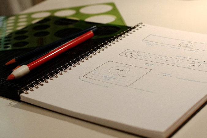
So, from an old-school designer’s point of view, Gridbooks are spectacular. Halfway through testing – with markers, pencils, and circle templates scattered on my desk – I wondered, “Why the hell wasn’t there something like this years ago?” They give you just enough guidance to make concepting easier without getting in the way of the creation process. They are surprisingly versatile, effortlessly usable, and beautifully minimalistic.

That beauty is only “so” nice though, and I like that. As any proper pen and pad snob will eventually confess; if the product is too nice, it risks never being used. I have a stack of sketchbooks and a mug of like-new pens because I am terrified I will ruin them by scrawling something unworthy of their perfectly designed form. Not so with Gridbooks. While they are attractive enough for any designer to carry into a brainstorming session they aren’t so good looking that they will never get used.

The cover of the Ad Book is a toothy 80 lbs. cover stock. It’s folded over on itself for added weight and it’s discretely printed in silver ink. The paper for the interior pages is an 80 lbs. text weight with just the right finish for pencil or pen. The grid lines and dots are just visible and all but disappear under your sketching; a feature I wish I could get from a certain Milan-based notebook company whose products I covet more then my next breath.

Gridbooks also use an ingenious technique of overlaying many grids on the same sheet. All the key ones are there; banner ads, skyscrapers, and big boxes. Each one is color coded for easy identifying and they are all pixel accurate. The same is true of the web layout pad with it’s 960 pixel 8, 12, and 16 column grids in addition to 3, 4, 5, and 6 column grids.

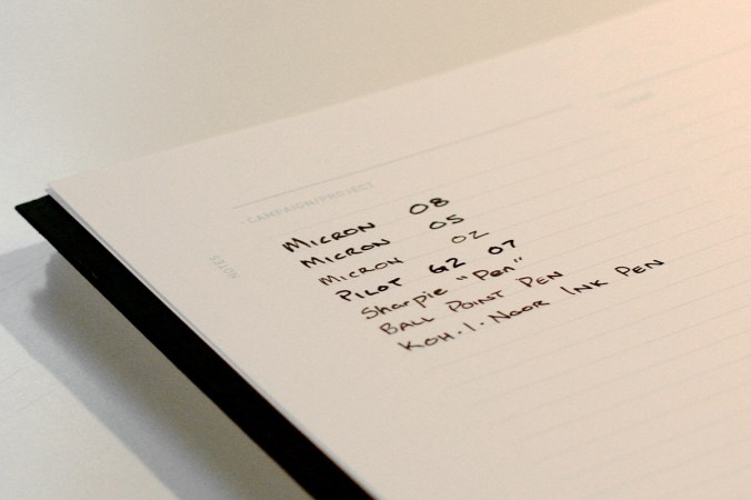
I tried a variety of pens and was pleased to find that they did not lose their edge or bleed through the page. You can truly use both sides of the sheet without fear of blotting up past ideas.

Gridbooks are worth every dime of the purchase price. I firmly believe that sketching is still superior to jumping straight into Photoshop, Fireworks, or even Balsamic. Sketching forces you to focus on the big picture and not get bogged down in the details and Gridbooks make that process faster and more painless then ever.

All photos by Josh Tuck. (In fact, these are the best photographs this blog has ever seen! I need Josh to take all my pictures.

Image Gallery: