No. 2 — a beautiful pencil-scented fragrance with an unfortunate name

I’m taking a break from my not-actually-a-blogging-hiatus here to share something interesting. You may remember my post from 2014 about the “Number Two (Pencils Shavings)” perfume from DSH Perfumes. It was designed to be a wearable essence and a scent for a room diffuser, though it never really struck me as really smelling like pencils.

Well, there’s a new pencil-scented fragrance in town, and it’s also called “No. 2,” this time from Portland-based artists Rory Sparks and Catherine Haley Epstein. They combined their love of pencils and perfume into a perfect fun project. Rory, a listener of The Erasable Podcast, was kind enough to send me a sample for review.

IMG_8894

The sampler spritzer of No. 2, kindly sent to me by the artist. The pencil stub is a nice touch!

I have to admit, the presentation is fantastic. My sample spritzer came wrapped with a short pencil stub to reinforce that the “No. 2” title was, in fact, referring to the pencil grade and not how people usually associate “number two” to smells.

Here’s the thing. While this scent smells distinctly different than what I remember the DSH scent to smell like (though I don’t have that vial any more to compare), it still doesn’t really smell like pencil shavings. I suspected the problem may be mine, and not the perfumes, though, so I took it into work and shared it with some coworkers.

Sure enough, I got a lot of comments about it smelling “woody” and a little “mineraly,” which I think confirmed that suspicion. My sense of smell is pretty out of tune. I blame years of bad childhood allergies and a perpetually stuffed nose and swollen sinuses.

Here’s the official description from the product page:

This scent was designed to honor the pencil. Like a pencil it is sharp, may be used as an under layer and blends in with just about everything. Yellow paint, splintered wood and metallic graphite serve as the springboards. The scent is made entirely of natural components of trees, leaves and citrus. Enjoy!

IMG_8895

Here’s the joint artist statement and a very cool personalized golf pencil from their ongoing art project.

If you want more information on this scent-based art project, check out Catherine Haley Epstein’s website, MindMarrow, for her project statement. And, if you want to smell like you just sharpened 50 pencils (as I did the other day), head over to her shop for various volumes and packaging options of the scent.


“How I wish I may do it as gallantly as you:” A letter written in pencil to Dorothea Lange by John Steinbeck

Just across the bay from San Francisco is Oakland, a city that often lives in the shadow of SF, but has so many cool attributes in its own right.

On Sunday, I went to one of Oakland’s gems, the Oakland Museum of California. In addition to some amazing permanent installations, we saw a temporary exhibit featuring the photography of Dorothea Lange, a prolific documentary photographer from the early- to mid-1900s.

She’s perhaps best known for her series on the displaced farm families as they migrated from Oklahoma to California in the 1930s, and on the forced internment of Japanese-Americans by the US government during World War II.

(And among a certainly online community, she’s also known for having a Blackwing Volumes edition tribute — the red-ferruled Volume 344.)

The photography was powerful, the narrative was fascinating and there were really great interactive elements of the exhibit, featuring creative photo cropping, grouping photos to tell a story, and other immersive lessons.

A display featuring a letter written to photographer Dorothea Lange by author John Steinbeck in 1965. Displayed in the Oakland Museum of California.

But the piece that really held my attention was a letter written to her by John Steinbeck just a few months before her death in 1965. He thanked her for the use of her photographs for a collection of articles he wrote in a pamphlet called Their Blood is Strong, about the Great Depression and American migrant workers.

(If you don’t know who John Steinbeck is, I can’t help you. But let’s say for the sake of this article that he’s a guy who wrote books and is perhaps the most famous modern pencil user. He also has a Blackwing Volumes tributed to him — the all-black Volume 24.)

When I got up close to the display, I noticed that the letter was written in pencil! Its a bit hard to tell from this photo, but the marking is extremely dark. If Steinbeck was writing with one of his favorite three (the Eberhard Faber Mongol, the Blaisdell Calculator 600, and the Eberhard Faber Blackwing 602), I’d guess that it’d be the Blackwing.

(An Erasable group member put together a project called The Steinbeck World Tour, a collection of those three pencils that was mailed to participants, so they could experience them. I got to try them out in Spring 2016, and can speak from experiecne that the Blackwing is indeed the darkest and smoothest. Although the Blaisdell is pretty close.)

The Steinbeck Trio: three pencils lauded by Steinbeck.

The Steinbeck Trio: three pencils lauded by Steinbeck, accompanied by a baseball card and an Field Notes pocket notebook with an Erasable sticker.

I love this quote from Steinbeck’s letter to Lange:

We have lived in the greatest of all periods. If the question were asked, if you could choose out of all time, when would you elect to have lived, I would surely say — the present. Of course we don’t now how it comes out. No one ever does. The story ends only in fiction and I have made sure it never ends in my fiction.

A transcript of Steinbeck's letter to Lange.

Notice how great Steinbeck’s handwriting was. It’s hard to believe, since he wrote so much by hand, that his pencilmanship didn’t degrade over time. But I guess when you’re writing a letter to one of “the giants” like Dorothea Lange, you slow down and take your time so your writing is legible. Even if you’re John Steinbeck.

Thank you to the Oakland Museum of California for the exhibit, and for giving me the opportunity to see this artifact of an  interaction between these two giants.

Two stationery products that bring me joy

If you’ve ever seen photos from my home office, you will probably know that I’m a pretty cluttered person. I just like acquiring physical objects, and I form emotional attachments to them pretty easily. That may be a reason why I like writing about stationery — it gives me an excuse to amass more stationery.

I blame it on my mother, although that’s probably unfair.

1468451123.jpegThere’s a great book that’s gained popularity in the last year or two, called The Life-Changing Magic of Tidying Up by Marie Kondo. It’s a bit painful to read, mostly because it usually tells me things I don’t want to hear about consuming, mindfulness and time-management . One chapter that really stood out to me, though, is when Kondo lays out criteria of what possessions you should keep, and which you should get rid of — often, she says, we look at it wrong:

Focusing solely on throwing things away can only bring unhappiness. Why? Because we should be choosing what we want to keep, not what we want to get rid of.

She continues writing to say that when deciding what to keep, you should hold it in your hand (if that’s possible), reflect on it, and if it sparks joy in your mind, keep it. It happens with more rarity than you might think.

(If you’re interested in learning more about this book, listen to this episode of Covered, a podcast by my friend Harry Marks. He discusses books, and reviewed this one in particular.)

All this is to say that while I do love pencils, notebooks, index cards and yes, even pens, not all of them bring me joy.

There are a few lately that do, however.

Nataraj Pop Pencil

Nataraj Pop pencil

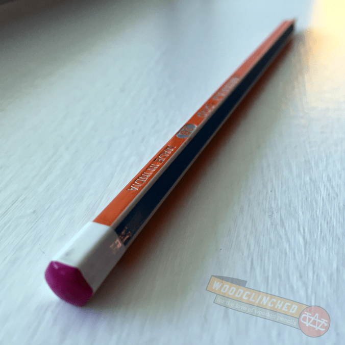
I picked up a couple of these beauties last November when I went to CW Pencils. I didn’t expect much of them — I’ve heard of Nataraj before, but I’ve never really used their products.

Nataraj pencils are made by the Hindustan Pencils company, founded in 1958, they’re the largest pencil manufacturer in India. Hindustan also makes Apsara, another fantastic brand rare in the US.

Closeup of Nataraj Pop pencil writing in a Write Notepads Kindred Spirit Edition pocket notebook

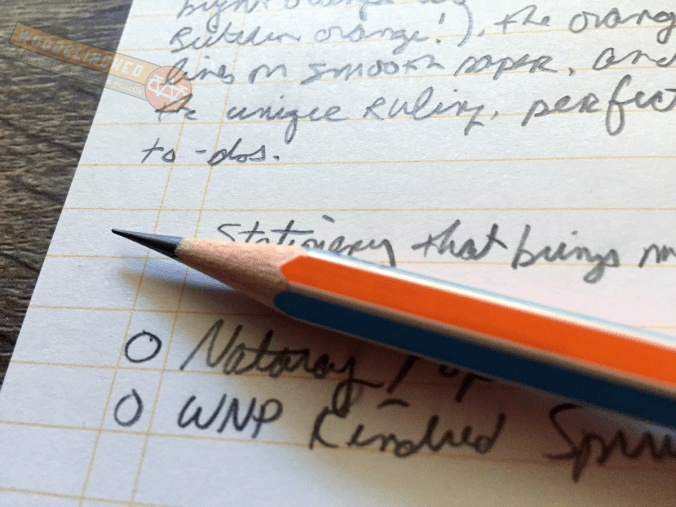
They originally attracted me for their “extra dark” graphite — 2B, in fact, which I prefer over the regular HB (or #2 in America-talk). They write dark and smooth, and seem to retain a point a bit longer than other 2Bs, which I appreciate.

After a while, though, I realized I liked it more for aesthetic reasons. Each side of the hex alternates in a bright, candy color, and the capped end is dipped in an accent color. My favorite scheme, for example, has yellow and blue-grey sides, and a bright, green-apple-green cap. It matches my Baron Fig Three-Legged Juggler Confidante perfectly.

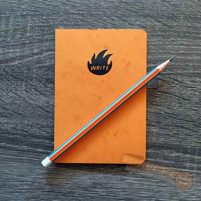
Write Notepads Kindred Spirit Edition Notebooks

Write Notepads Co. Kindred Spirit edition notepad with a Nataraj Pop pencil

Although I don’t think I’ve written about them here, which is a shame, I’m a huge fan of Write Notepads & Co, a Baltimore-based notepad company. Johnny Gamber, my friend and colleague from Pencil Revolution, and also a Baltimorean, gets to hang out at the WNP shop on the regs and I’m completely jealous.

Chris Rothe, the guy who runs WNP, recently started a pocket notebook membership service. Unlike the subscription service that Field Notes COLORS or Blackwing Volumes runs, his is a membership subscription that not only gets you those quarterly runs, but also makes extras available to you for purchase.

The second-ever edition, “Kindred Spirit” is magnificent, and definitely brings joy for me. It’s a bit wider and bit thicker than a Field Note cahier, and its perfect-bound spine looks more rugged, though I suspect it takes longer to break it in than a saddle-stitched binding like Field Notes.

The package is mind-blowingly gorgeous — while other pocket notebook page are bound austerely in a belly band, these three-packs come in a little box with an ornate illustrated pressed into it.

Once I’m past the box, I really love the cover — Chris used French Paper’s Dur-O-Tone Butcher Orange, pretty famous among paper nuts for being the first of Field Note’s COLORS edition.

(As perhaps a nod or a tribute to Field Notes, Chris threw in 25 Butcher Blue-covered notebooks, used for the second FN edition, and just as rare and coveted.)

Lining of the Write Notepads & Co Kindred Spirit pocket notebook, seen here with a Nataraj Pop pencil.

What’s particularly joyful to me, though, are the insides. The pages are lined with a bright orange ink, that looks like it matches the cover, and there’s a couple of vertical lines a centimeter or two in from the left, making it perfect for to-do lists, and is unobtrusive if you want to ignore it.

What are the similarities here?

Well, for one thing, they’re both bright and colorful in a pretty unique way, and they’re both pretty simple in execution. Neither are top-shelf, yet are far from the bottom. They’re a joy to hold, to behold and to use.

That’s an interesting thing to think about — I never realized that these commonalities are something I’ve found particularly joyful. But it makes sense. I’m also a huge fan of the Three-Legged Juggler Baron Fig Confidante, European Bic Crystals that are orangish instead of clear and I keep buying those damn Staedtler Wopex pencils in bright colors, even though I’m not a huge fan of how it performs.

What kind of stationery brings you joy? Are there any common traits that run among them?

“The Greatest Invention of All Time” — an interview with Count von Faber-Castell

There’s a wonderful piece of travel journalism on FREITAG Grand Tour — a blog run by the Swiss bag manufacturer FREITAG. They sent a reporter to Stein, Germany, to tour the Faber-Castell campus and talk with Count Anton Wolfgang Graf von Faber-Castell. Don’t worry, this is in English:

The count pushed his chair back slightly. We were sitting on wooden chairs with peanut-brown cushions decorated with the outline of flowers.

“We have a minister in Stein who one day decided that henceforth, he should type his sermons on the computer to keep up with the times. Previously he had always written his sermons out by hand. Do you know what happened?”

“No.”

“When he reached the pulpit, he realized he couldn’t remember anything at all. He had to read out his sermon line by line, something he had never had to do before.”

I love this description of the Count, his generations-old company, and his bemused, poetical waxings about pencils. In my head, his voice sounds like Bane from The Dark Knight Rises, but with a German accent.

And he’s very dignified and aristocratically handsome — exactly what I’d imagine the head of this company would be like:

Count Anton Wolfgang Graf von Faber-Castell: Don't you think Christopher Plummer should play him in a movie about Faber-Castell?

Don’t you think Christopher Plummer should play him in a movie about Faber-Castell? (Photo from FREITAG Grand Tour.)

Go check it out. It’s a great read.

(And a big thanks to /u/magicpainter for sharing it on Reddit!)

Pennaquod, the stationery blog search engine

This is pretty cool — introducing Pennaquod (pronounced “PEN-a-quad”), a Google-powered search engine created by Ian Hedley, editor of Pens! Paper! Pencils!

From his blog post about the new site:

I was frustrated with trying to find pen reviews and search results being swamped by ebay and Amazon listings so Pennaquod searches only sites that have chosen to be part of it.

That’s a great idea. There are definitely times when I wanted to look up a pencil review from years ago, and I can’t remember if it was on, say,  Pencil Talk or Pencil Revolution.

This searches 24 different pen, pencil, paper, et cetera sites, all of the top-notch. He’s growing the list, I know, but he wants to make sure the bloggers opt-in to appear on the list. I’m honored to be among them.

Thanks, Ian, for this service to the scribomechanisphere!

(By the way, if you’re reading this on Woodclinched.com rather than an RSS Reader — see the little glyph at the end of the headline?

Link Headline

That indicates that this post is a “link post”, meaning that you can just click the headline to be taken to the link I’m talking about.

Some of you may be familiar with Daring Fireball or Marco.org, or another link-blog-style site. I love that editorial style for when I want to share something. This is my hybrid attempt to emulate that.)