Harry Marks on the Dime Novel Field Notes edition

I don’t often have guest reviews on this blog, but when Harry C. Marks comes at me, I know it’s gonna be good. Harry’s an internet-friend who I’ve made sure to hang out with in real life several times, a long-hand novelist, and, like me, a stationery lover. He recently reviewed the latest Field Notes release, Dime Novel.


Field Notes Dime Novel. Photo by Harry C. Marks.

I’ve appreciated Field Notes notebooks for some time. I wouldn’t call myself a “fan” in the truest sense as I tend to skip most releases. Nor am I an obsessive collector, so when an edition comes out that captures my attention, it’s something special.

The first Field Notes I ever bought were the Drink Local editions. The perfect notebooks for Fall in hues of brown and orange, fallen leaves scattered on the table. Even the covers crunched when I cracked their spines.

Then came the Workshop Companion edition—six notebooks meant for six different kinds of projects, from woodworking to car repair. I’m not much of a handyman, but the package was too beautiful not to have on my shelf.

Finally, there was Byline. This was it: the perfect Field Notes for me. A departure from their usual staple-bound pocket fare, the Byline was an extra-long, spiral-bound reporter’s notebook clad in a utilitarian gray and filled with some of the smoothest, creamiest paper I’d ever used. Its brutalist aesthetic concealed an inner beauty, 70 pages of gold between two layers of rock—and I craved more. I traded with friends, some sent me spare books in care packages, and I hoarded them among my growing collection.

I thought I’d never find another book as perfect as the Byline. Then I opened my email last Monday afternoon.

Field Notes Dime Novel. Photo by Harry C. Marks.

The Field Notes Dime Novel Edition is the company’s Fall 2017 release and the 36th limited edition in the lineup.

And it. Is. Gorgeous.

Field Notes Dime Novel. Photo by Harry C. Marks.Reminiscent of old dime novels of the 19th century, the notebooks stand at 4-1/4″ by 6-1/2”, roughly the same dimensions as their namesake. Three separate notebooks comprise the 72 pages within and are Smyth-sewn inside a thick, brown-orange cover.

Field Notes is no stranger to experimenting with its covers. The blinding, aggressive Unexposed editions were better left that way. The cherry veneer of the Shelterwood put a tiny tree in everyone’s pockets. The Snowblind edition forced writers and note-takers out of the house as its stark white cover shifted to blue when exposed to sunlight. These gimmicks all had the same purpose: differentiation. No other pocket notebook had a wooden cover, nor one that changed colors in sunlight, and no company was blind-mailing subscribers random notebooks without first knowing the contents of each envelope.

This is what makes the Dime Novel edition so interesting. The form factor is different from the usual lineup, but not so drastic as a Byline. The cover doesn’t have a pop-out ruler or foil coating. It’s just brown paper debossed with black ink. While more elaborate than, say, the America the Beautiful edition, it lacks the pop of some of the more intense covers mentioned above.

Field Notes Dime Novel. Photo by Harry C. Marks.

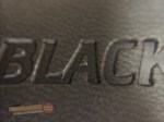
That said, the Dime Novel cover isn’t simple. Within its black borders are lines of text meant to sell the notebook and illustrate its purpose. “Practical Beauty and Value,” “Adventures in Creativity,” “A Pocket Companion” all adorn the front, arranged to fill the space and yet be easily glossed over. The two things that stand out are the words “FIELD NOTES” at the top and “‘Dime Novel’ Edition” toward the bottom. Everything else is white noise. The surrounding text provides dimension, but can be easily ignored.

The original Beadle dime novel covers were not meant to be ogled. They were there to keep the pages from falling out. I see Field Notes’ homage in much the same light; the deceptively simple cover is there to protect your words and sketches, then get out of the way. What’s surprising about this edition is just how inspirational and aspirational it seems. This is a book begging to be written in and yet holding it, it feels too beautiful to sully with one’s own musings. How funny is that? A notebook modeled on cheap, mass market “literature” isn’t cheap looking enough for the average to-do list.

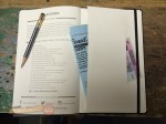
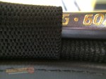
The 72 numbered pages inside are a hearty 70# stock seemingly made for pencil. I tested the paper with a Blackwing 602 (firm core) and a Blackwing 24 (extra-firm core), as those are the two pencils I use most. The paper has a very slight tooth to it that grips the point tightly, but doesn’t erode it to a nub after a few strokes. Artists and sketchers will probably like this paper a lot, but I defer to them for final verdicts, as I do fountain pen users. As a pencil user, I’m pleased.

Field Notes Dime Novel. Photo by Harry C. Marks.

This edition feels like a paperback in the hand. Given a few weeks in a back pocket, it’ll probably start to look more like an original dime novel than the crisp notebook in these pictures, with the cover crushed and faded like your granddad’s old hat. My only complaint concerns the blank pages. I’d hoped a notebook centered around literature would’ve provide writers with the lines necessary to write their own, but blank is more versatile. Fair enough. It’s probably my bias talking anyway—I almost never buy blank notebooks and I have no use for grids.

NaNoWriMo is fast approaching and I’ve been outlining my first attempt in a Byline. I’d originally planned to knock out my daily 2,000 words in Scrivener on my laptop, but the arrival of these Dime Novel notebooks have presented a new challenge. With a guide slipped behind each page, might I tackle the Kerouac-ian effort of writing 50,000 words in one month by hand instead? The thought of seeing what could become a published novel get its start in a such a format is enticing. Even more so when I imagine the mason jar on my desk stuffed with Blackwing 24 stubs by the end of November.

Whether I decide to tackle NaNoWriMo digitally or otherwise is yet to be decided. What’s certain is my lust for this latest Field Notes edition. These books will be used and for something greater than to-do lists. They deserve it. Sometimes, you don’t need to reinvent the wheel to capture the attention of a jaded group of collectors. Sometimes, you just need to make a simple, beautiful notebook—a work of art meant to inspire other works of art, and these notebooks have inspired me.


Many thanks to Harry C. Marks for his review of this beautiful notebook! You can find Harry online at HCMarks.com or listen to his podcast, Covered, about writers and their books. In his current season,  he’s talking exclusively to women authors about their books, and recently chatted with pencil friend Caroline Weaver about her book, “The Pencil Perfect.” It’s so good, and very pencilly, so you should have a listen. —Andy

Two more Blackwing notebooks to complement the Slate

It’s been a minute since I’ve written anything about Palomino Blackwing/Pencils.com/CalCedar. But it’s not for want of any new products from them. They’ve been busy!

Their latest release is a great follow-up to my post in Summer 2014 about the Blackwing Slate, a Blackwing-branded A5-sized journal. Since that release, they haven’t said much about their line of paper products, though I’ve seen the Slate in most stores that carry their pencils. I figured they’ve been concentrating on their (very ambitious) quarterly Volumes releases.

But it was in the last Volumes release that they gave us a taste of what’s to come. The Volume 205 edition (the “jade” edition) included an extra. A small, single, pocket-sized notebook with the same leather-ish polyurethane black cover as the Slate.

blackwing-notebooks-1Later on, they announced it was called the Blackwing Clutch. And they followed that up with the Summit, a larger, 8.5 x 10” edition.

blackwing-notebooks-2
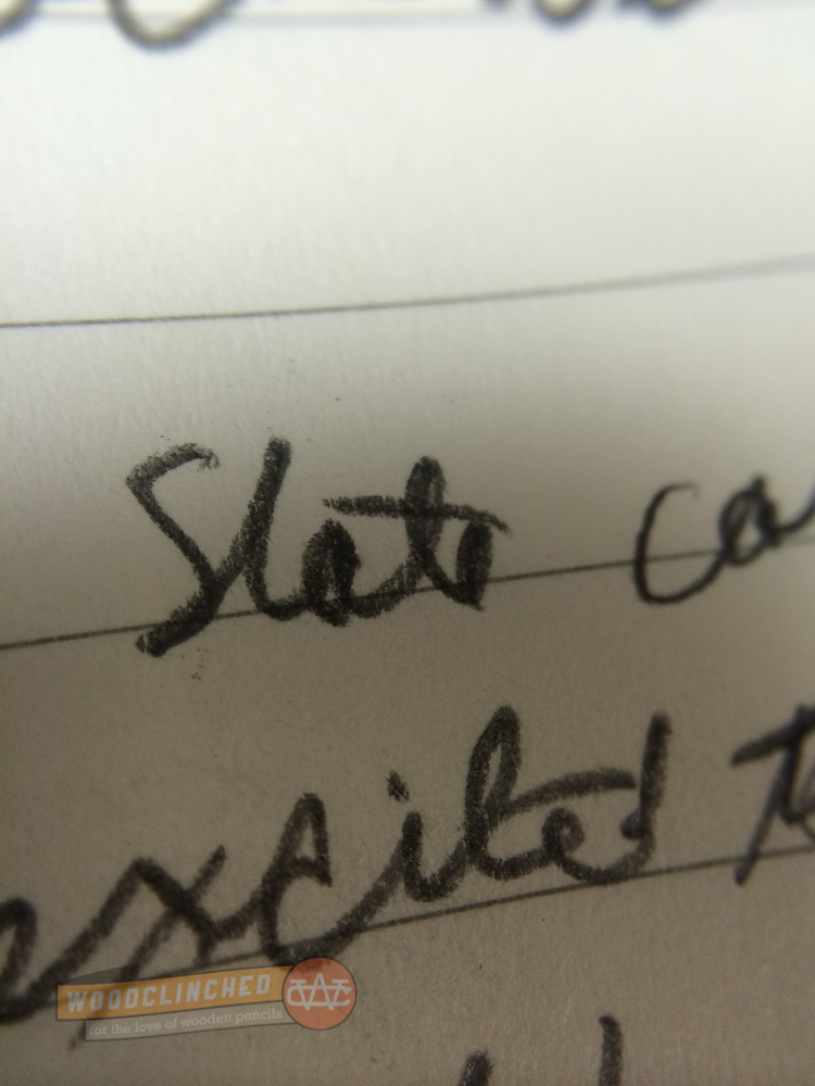
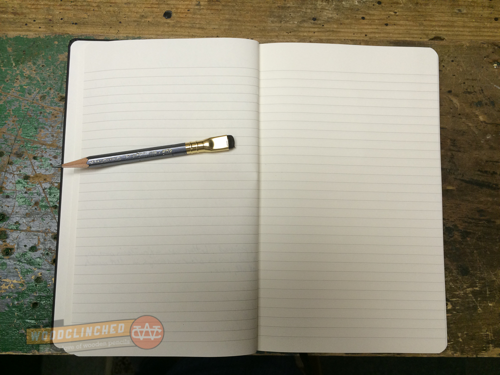
Like the Slate, the Clutch and the Summit are plain black with a creamy, thick paper. Unlike the Slate, they are perfect-bound with a contiguous cover from front to back, similar to a Write Notepad notebook. And they have a soft cover; similar to a Moleskine, though with a better, thicker cover.

One thing about both of these new notebooks was bugging me — the name. The “Slate” makes sense — it’s another name for a handheld writing surface. But what about the “Clutch” and the “Summit”?

Finally, I emailed Alexander, Blackwing’s brand manager and asked. He said:

“The ‘Clutch,’ because it will (hopefully) come in clutch when you have a great idea on the go, and because it opens like a clutch bag. The ‘Summit,’ because we envision this being more of a meeting/desktop/workplace notebook, and because it’s our largest notebook offering.”

(“Clutch,” for those of you who don’t know, is slang for “performs under pressure.”)

Aesthetics

blackwing-notebooks-iphone

I’m a fan of the matte black covers — they match my iPhone really well, so when my notebook and phone are laying on a desk next to each other, it looks like I planned it that way.

That said, I’m generally drawn to stationery items with a bit of color. The Baron Fig Three-Legged Juggler and the Write Notepads Kindred Spirit are two notebooks that come to mind.

But these are subtle and classic, and complement their pencils really nicely. Blackwing pencils are themselves not subtle (though I do think most of them are pretty classic), so unlike a bright pocket notebook (Say, the Field Notes Unexposed edition), these notebooks won’t draw attention away from them.

The Form Factor

One of the big advantages to the Clutch, Blackwing says, is to use it sideways, in “clamshell mode,” as it were. Two things about this:

  • That’s not a particularly unique value proposition — you can do that with any saddle-stitched or perfect-bound pocket notebook. And really, anything that’s graph or dot-grid ruled.
  • Also, the notebook isn’t particular good at being used sideways like that — the binding is very tight and it’s hard to break the spine on some pages.

Like other perfect-bound pocket notebooks, the Clutch is bound in such a way that in order to let it lie open, one must “crack” the spine —

bendy-blackwing-notebook
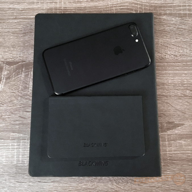
The Summit makes no such claims. The binding is a bit different — it’s more of a traditional journal, with the cover material tucked underneath the end sheet.

The Paper

Like the Slate, these two has a thick 100gsm ivory paper. It’s luxurious and smooth, but kinda smeary. I don’t know why I didn’t notice it in the Slate, but looking back, the Slate’s paper seems toothier. Check out the smear from this Blackwing Pearl:

smear-testAnd that’s not even the softest Blackwing out there.

Despite the smeariness, I like it a lot. It feels like paper befitting a luxury brand.

I am, however, not a huge fan of the dot grid here. It’s well-spaced — just about the same as the Baron Fig Confidant. But the dots themselves are big and bold, which makes them feel a bit intrusive. I would much prefer them to be smaller and lighter.

blackwing-notebook-7

The darker but smaller dot grid of a Blackwing Summit notebook next to the grayer but bigger dot grid of a Baron Fig Confidant

Both the Clutch and the Summit come in dot grid, lined and blank (the latter two I haven’t tried).

The Price

This is where you really see what “luxury brand” means. Like their pencil counterparts, this is not cheap. A three-pack of the Clutch notebooks are $14.95. The Summit is just a dollar cheaper than the Slate, at $21.95.

Is it worth it?

This is something you’ll have to determine for yourself. For me? It’s worth the quality they put into the notebook. They seem way more sturdy than the $12-per-pack Field Notes (only time will tell, though).

However great the quality is, I still would prefer a bit of color in my notebook. The Baron Fig Confidant and Vanguard limited editions are great for me in that regard, as are Write Notepads’ pocket notebooks. The Blackwing notebooks don’t appeal to me, aesthetically, as much as they do. If you like a subtle, classic black, I wholeheartedly recommend them.

I will certainly keep coming back to Blackwing for pencils, though. My Volumes subscription renews in a week, and that’ll be the start of my third year as a subscriber.

Check out the Blackwing Clutch at Blackwing602.com. And the Blackwing Summit. And if you haven’t seen it before, the Blackwing Slate is the hardcover journal sized right in the middle.

And thanks to Blackwing for providing me a pack of the Clutches and Summits at no charge for review purposes.

The Waverley Tartan Cloth Commonplace Notebook: Beautiful, but oddly ruled

I love plaid.

I don’t know if it’s because of my ten years of Catholic school — or perhaps in spite of it — but the colorful, patterned cloth has appealed to me for as long as I can remember. Perhaps none have been present in my wardrobe more than Black Watch plaid — a simple, understated green and blue plaid with roots in Scottish military garb born out of the unsuccessful Jacobite rebellion in the early eighteenth century.

I had a Pendleton wool scarf, which I cherished, and, in my late teens and early 20s, even a wool sweater vest!

Ladies.

Thats why, when I first became aware of Waverley’s tartan cloth-bound collection of journals from my friend Gary Varner’s blog, I was instantly lovestruck.

Continue reading

POSSIBLE SPOILERS: Field Notes Unexposed Edition Unboxing Video

Warning, if you don’t want the new, mysterious Field Notes edition spoiled for you, don’t want this video. If you do, then, ONWARD!

There are a few more observations I’ve had, after looking at the Field Notes for a bit longer.

The first is that I think this is the first time Field Notes has had a registered trademark symbol (®) next to the Futura’d “FIELD NOTES” mark on the front. That bums me out a bit, partly because, well, it means that some lawyers got ahold of it, but also because it’s moving one more step away from the original intent of a pocket notebook like this. It’s more of a brand now.

I completely understand why they did it, and if this was my product, I’d probably do it too.

The notebook comes in six varieties:

  • Purple with green words,
  • Green with orange words,
  • Orange with blue words,
  • Blue with pink words,
  • Pink with yellow words, and
  • Yellow with purple words.

Here’s a photo. SPOILERS:

Field Notes Unexposed complete set. Photo by Mike Finneran, posted to the Field Nuts group on Facebok

Field Notes Unexposed complete set. Photo by Mike Finneran, posted to the Field Nuts group on Facebok

They’re all very bright, made from flourescent soy-based inks printed on a white 100# silky paper. The inside color is the inverse of the outside.

One of my favorite things about it is that it resurrects the paper used in the “Night Sky” edition — a 50# bright white paper with a light grey application of their “reticle” graph — basically, it’s a dot grid, but instead of dots, they’re little “+”s.

Here's a Night Sky Field Notes I'm in the middle of, and its "reticle graph" paper. This paper is identical to what the Unexposed edition uses.

Here’s a Night Sky Field Notes I’m in the middle of, and its “reticle graph” paper. This paper is identical to what the Unexposed edition uses.

What I was expecting

When Field Notes sent the email teasing the edition, they included this image:

Field Notes teasing email

And then when they announced the name of the edition, “Unexposed,” I naturally thought about photography. After all, this is a very “art school” photograph, and it’s almost like a pinhole camera. They said the edition was sealed in an opaque paper, so I was hoping that the cover was photosensitive — maybe they changed color when opened and exposed to light.

That would have been so cool, wouldn’t it?

Schrödinger’s Notebook

Schrödinger's Notebook
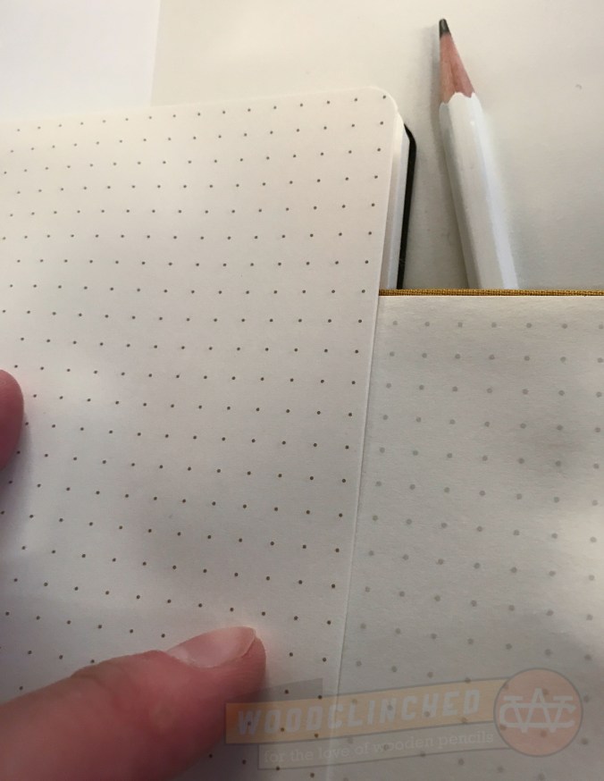
Okay, bear with me here, because I’m going to wayy overthink something.

A friend and I had an interesting discussion about this edition on Facebook. When Field Notes announced it earlier this week, they didn’t give away any details of each notebook. But they did say that each three-pack will be sealed with an opaque paper, and the colors in each three-pack will be chosen at random.

That’s right: no one will know which three of the six colors are contained therein — only by opening it (and thus devaluing the set), will they know if they have all the colors.

This sets up a conundrum: Do collectors keep them sealed, maintaining maximum value, or do they open them, and trade until they have all the colors?

I theorized that this is an anti-collector’s edition: that Coudal and Draplin are trolling the collectors by introducing this conflict into their acquiring.

My friend brought up an interesting counterpoint, however, and rightfully so — that in fact, this is the ultimate collector’s edition, and because collectors will be tempted to open the sealed packs, the number of the sealed pack will seriously lessen over time.

This would create a meta-collectability — that eventually, those who don’t care about the colors, but care only about the sealed notebook packs, would pay top-dollar.

For those collectors, the unknown factor of what colors are inside is a bit thrilling — the colors are unknown, for as long as they are in that meta-collection, they cannot be known.

Erwin Schrödinger might say that the colors on the notebook both exist and do not exist.

Regardless, these notebooks are a joy to look at, to touch, and eventually, to use (I have a Night Sky to work through, first).

The Blackwing Slate: The pencil-optimized notebook

It’s a really exciting day today, folks. It marks the ninth anniversary of my friend Johnny Gamber’s first pencil review on Pencil Revolution! He wrote about Pencils.com’s ForestChoice pencils.

It’s speculated by Pencils.com’s Fearless Leader (and CalCedar president and CEO) Charles Berolzheimer, this is the first pencil review, ever, on the internet. (And to celebrate that, Pencils.com is having a one-day-only sale on ForestChoice products — 25% off!)

Congratulations, Johnny! Long live the Revolution!

Blackwing Slate

Yesterday marked the first day the Blackwing Slate was available for purchase. If you get emails from Pencils.com, or have been reading the blogs at Pencils.com and Blackwing602.com (there’s a lot of websites nowadays in this franchise), you may have seen teasers for this product. It’s a Moleskine-like notebook, but improved for co-branding with the Palomino Blackwing. And, in my opinion, way nicer than a Moleskine.

It seems that the devil is in the details with notebooks nowadays. The Baron Fig, reviewed here back in April, excelled in the little design choices that set it apart from its rivals. The same thing applies to the Slate — there are numerous little improvements that really make it stand out.

The Exterior

Its size is quite similar to the Palomino-branded journal line at 5” by 8.25”. The cover is a bit thicker and softer,though, and very matte — more of a shark skin feel to the harder, shinier Palomino hardcover. I’m not sure about this softness — I hope that it means it won’t scratch easily. Only time will tell. Besides that, it’s quite nice to touch.

Blackwing Slate Cover Closeup

It has a really nice thick elastic loop on the spine for a pencil, which is a great feature. This isn’t a dinky little piece of elastic either — this thing looks like it’ll hold its stretch for years.

Blackwing Slate Spine

Speaking of spines, the really innovative thing (in my opinion) about the Slate is the spine. because there’s a pencil strapped close to the spine, the two thick covers stop at the edge, and then are bound together with a substrate (I think I’m using that word correctly here). Essentially, the spine is reinforced, not with an extension of the cover board, but with the cloth that binds the cover to the signatures of pages inside.

It results in a very flexible cover — the first time I opened it, it wasn’t stiff at all. And I can even open it with the pencil still in the loop, which is great. It seems like it might make the notebook less durable — if the cover’s not protecting the spine, will it tear easier? Again, time will tell.

The Paper

Writing in the Blackwing Slate

Man. I love, love this paper. It boasts a 100gsm paper, compared to the Palomino luxury notebook’s 90gsm and Rhodia’s 80gsm paper. It’s so thick and plush, you guys.

It’s available in both lined and plain. Since the guys at Pencils.com know I am not an artist, they sent me a lined one to try out. The grey lines are set apart 0.25” on an off-white paper. The paper is smooth, but not as smooth as Rhodia paper. It has a little tooth on it, specifically engineered — I hope — for pencil. It’s the perfect amount to grab your graphite but still feel smooth.

Closeup of Palomino Blackwing 602 writing in Blackwing Slate

I tried it out with a medium-nib fountain pen, just to see how the paper held up to ink (though it would be sacrilege to use anything but pencil in this notebook!), and it worked great! No bleeding of note at all on the opposite page.

Closeup of a medium-nib fountain pen ink in Blackwing Slate

The opposite page from the fountain pen wriiting. As you can see, there is virtually no bleed-through! This is some thick paper.

The opposite page from the fountain pen writing. As you can see, there is virtually no bleed-through! This is some thick paper.

The Details

Besides the spine, this is what really gives the Blackwing Slate its distinction, and contributes greatly to those details I mentioned earlier. It has all the Moleskiney amenities, but all a bit nicer than the Moleskine’s — a satin bookmark, an elastic strap to keep the cover closed, a paper pocket in the back to hold stuff.

There are two different pockets in the flap in the back!

(That pocket is interesting — it’s actually a double pocket, with a small flat on the front for small things like, say, a driver’s license or credit card, and a wider one behind to hold things slightly smaller than the cover)

It even comes with a shiny new Palomino Blackwing 602 pencil tucked in the pencil loop on the spine!

It’s the details.

The Price

The Slate sells for $22.95, a full $9 more than a Moleskine Classic notebook sells at Barnes & Noble. The included pencil is worth about $2 of that price, so at $20.95, is the notebook worth it?

Depending on a lot of factors, of course, in general, I’d say that yes, it’s worth it. I’m not trying to bash Moleskine here (we actually had a discussion on the most recent episode of Erasable about how it’s become fashionable to look down on Moleskine), but the Slate is much better constructed, the paper is so much heavier and nicer, and for a pencil user like me, that elastic loop on the spine is wonderful.

Go check it out!

The Blackwing Slate | $22.95 at Pencils.com

Disclaimer: This product was sent to me, free of charge, for review purposes. No monetary compensation or additional direction was provided to me.