Two more Blackwing notebooks to complement the Slate

It’s been a minute since I’ve written anything about Palomino Blackwing/Pencils.com/CalCedar. But it’s not for want of any new products from them. They’ve been busy!

Their latest release is a great follow-up to my post in Summer 2014 about the Blackwing Slate, a Blackwing-branded A5-sized journal. Since that release, they haven’t said much about their line of paper products, though I’ve seen the Slate in most stores that carry their pencils. I figured they’ve been concentrating on their (very ambitious) quarterly Volumes releases.

But it was in the last Volumes release that they gave us a taste of what’s to come. The Volume 205 edition (the “jade” edition) included an extra. A small, single, pocket-sized notebook with the same leather-ish polyurethane black cover as the Slate.

blackwing-notebooks-1Later on, they announced it was called the Blackwing Clutch. And they followed that up with the Summit, a larger, 8.5 x 10” edition.

blackwing-notebooks-2Like the Slate, the Clutch and the Summit are plain black with a creamy, thick paper. Unlike the Slate, they are perfect-bound with a contiguous cover from front to back, similar to a Write Notepad notebook. And they have a soft cover; similar to a Moleskine, though with a better, thicker cover.

One thing about both of these new notebooks was bugging me — the name. The “Slate” makes sense — it’s another name for a handheld writing surface. But what about the “Clutch” and the “Summit”?

Finally, I emailed Alexander, Blackwing’s brand manager and asked. He said:

“The ‘Clutch,’ because it will (hopefully) come in clutch when you have a great idea on the go, and because it opens like a clutch bag. The ‘Summit,’ because we envision this being more of a meeting/desktop/workplace notebook, and because it’s our largest notebook offering.”

(“Clutch,” for those of you who don’t know, is slang for “performs under pressure.”)

Aesthetics
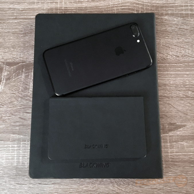
blackwing-notebooks-iphone

I’m a fan of the matte black covers — they match my iPhone really well, so when my notebook and phone are laying on a desk next to each other, it looks like I planned it that way.

That said, I’m generally drawn to stationery items with a bit of color. The Baron Fig Three-Legged Juggler and the Write Notepads Kindred Spirit are two notebooks that come to mind.

But these are subtle and classic, and complement their pencils really nicely. Blackwing pencils are themselves not subtle (though I do think most of them are pretty classic), so unlike a bright pocket notebook (Say, the Field Notes Unexposed edition), these notebooks won’t draw attention away from them.

The Form Factor

One of the big advantages to the Clutch, Blackwing says, is to use it sideways, in “clamshell mode,” as it were. Two things about this:

  • That’s not a particularly unique value proposition — you can do that with any saddle-stitched or perfect-bound pocket notebook. And really, anything that’s graph or dot-grid ruled.
  • Also, the notebook isn’t particular good at being used sideways like that — the binding is very tight and it’s hard to break the spine on some pages.

Like other perfect-bound pocket notebooks, the Clutch is bound in such a way that in order to let it lie open, one must “crack” the spine —

bendy-blackwing-notebookThe Summit makes no such claims. The binding is a bit different — it’s more of a traditional journal, with the cover material tucked underneath the end sheet.

The Paper

Like the Slate, these two has a thick 100gsm ivory paper. It’s luxurious and smooth, but kinda smeary. I don’t know why I didn’t notice it in the Slate, but looking back, the Slate’s paper seems toothier. Check out the smear from this Blackwing Pearl:

smear-testAnd that’s not even the softest Blackwing out there.

Despite the smeariness, I like it a lot. It feels like paper befitting a luxury brand.

I am, however, not a huge fan of the dot grid here. It’s well-spaced — just about the same as the Baron Fig Confidant. But the dots themselves are big and bold, which makes them feel a bit intrusive. I would much prefer them to be smaller and lighter.
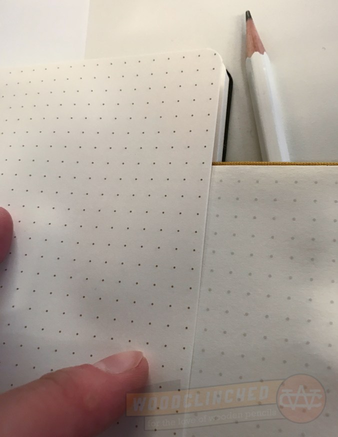
blackwing-notebook-7

The darker but smaller dot grid of a Blackwing Summit notebook next to the grayer but bigger dot grid of a Baron Fig Confidant

Both the Clutch and the Summit come in dot grid, lined and blank (the latter two I haven’t tried).

The Price

This is where you really see what “luxury brand” means. Like their pencil counterparts, this is not cheap. A three-pack of the Clutch notebooks are $14.95. The Summit is just a dollar cheaper than the Slate, at $21.95.

Is it worth it?

This is something you’ll have to determine for yourself. For me? It’s worth the quality they put into the notebook. They seem way more sturdy than the $12-per-pack Field Notes (only time will tell, though).

However great the quality is, I still would prefer a bit of color in my notebook. The Baron Fig Confidant and Vanguard limited editions are great for me in that regard, as are Write Notepads’ pocket notebooks. The Blackwing notebooks don’t appeal to me, aesthetically, as much as they do. If you like a subtle, classic black, I wholeheartedly recommend them.

I will certainly keep coming back to Blackwing for pencils, though. My Volumes subscription renews in a week, and that’ll be the start of my third year as a subscriber.

Check out the Blackwing Clutch at Blackwing602.com. And the Blackwing Summit. And if you haven’t seen it before, the Blackwing Slate is the hardcover journal sized right in the middle.

And thanks to Blackwing for providing me a pack of the Clutches and Summits at no charge for review purposes.

Two stationery products that bring me joy

If you’ve ever seen photos from my home office, you will probably know that I’m a pretty cluttered person. I just like acquiring physical objects, and I form emotional attachments to them pretty easily. That may be a reason why I like writing about stationery — it gives me an excuse to amass more stationery.

I blame it on my mother, although that’s probably unfair.

1468451123.jpegThere’s a great book that’s gained popularity in the last year or two, called The Life-Changing Magic of Tidying Up by Marie Kondo. It’s a bit painful to read, mostly because it usually tells me things I don’t want to hear about consuming, mindfulness and time-management . One chapter that really stood out to me, though, is when Kondo lays out criteria of what possessions you should keep, and which you should get rid of — often, she says, we look at it wrong:

Focusing solely on throwing things away can only bring unhappiness. Why? Because we should be choosing what we want to keep, not what we want to get rid of.

She continues writing to say that when deciding what to keep, you should hold it in your hand (if that’s possible), reflect on it, and if it sparks joy in your mind, keep it. It happens with more rarity than you might think.

(If you’re interested in learning more about this book, listen to this episode of Covered, a podcast by my friend Harry Marks. He discusses books, and reviewed this one in particular.)

All this is to say that while I do love pencils, notebooks, index cards and yes, even pens, not all of them bring me joy.

There are a few lately that do, however.

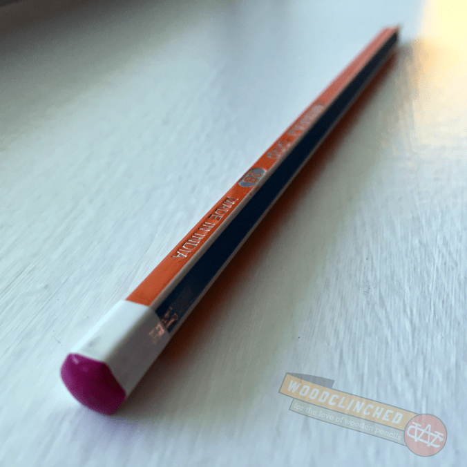
Nataraj Pop Pencil

Nataraj Pop pencil

I picked up a couple of these beauties last November when I went to CW Pencils. I didn’t expect much of them — I’ve heard of Nataraj before, but I’ve never really used their products.

Nataraj pencils are made by the Hindustan Pencils company, founded in 1958, they’re the largest pencil manufacturer in India. Hindustan also makes Apsara, another fantastic brand rare in the US.

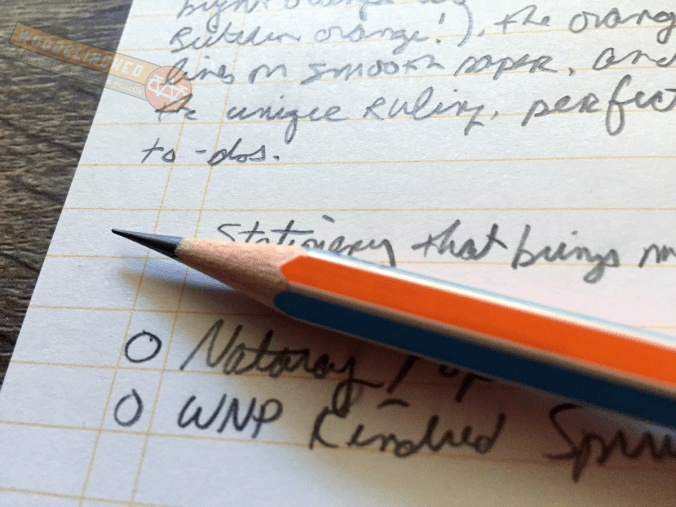
Closeup of Nataraj Pop pencil writing in a Write Notepads Kindred Spirit Edition pocket notebook

They originally attracted me for their “extra dark” graphite — 2B, in fact, which I prefer over the regular HB (or #2 in America-talk). They write dark and smooth, and seem to retain a point a bit longer than other 2Bs, which I appreciate.

After a while, though, I realized I liked it more for aesthetic reasons. Each side of the hex alternates in a bright, candy color, and the capped end is dipped in an accent color. My favorite scheme, for example, has yellow and blue-grey sides, and a bright, green-apple-green cap. It matches my Baron Fig Three-Legged Juggler Confidante perfectly.

Write Notepads Kindred Spirit Edition Notebooks

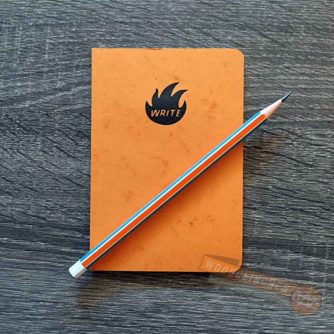
Write Notepads Co. Kindred Spirit edition notepad with a Nataraj Pop pencil

Although I don’t think I’ve written about them here, which is a shame, I’m a huge fan of Write Notepads & Co, a Baltimore-based notepad company. Johnny Gamber, my friend and colleague from Pencil Revolution, and also a Baltimorean, gets to hang out at the WNP shop on the regs and I’m completely jealous.

Chris Rothe, the guy who runs WNP, recently started a pocket notebook membership service. Unlike the subscription service that Field Notes COLORS or Blackwing Volumes runs, his is a membership subscription that not only gets you those quarterly runs, but also makes extras available to you for purchase.

The second-ever edition, “Kindred Spirit” is magnificent, and definitely brings joy for me. It’s a bit wider and bit thicker than a Field Note cahier, and its perfect-bound spine looks more rugged, though I suspect it takes longer to break it in than a saddle-stitched binding like Field Notes.

The package is mind-blowingly gorgeous — while other pocket notebook page are bound austerely in a belly band, these three-packs come in a little box with an ornate illustrated pressed into it.

Once I’m past the box, I really love the cover — Chris used French Paper’s Dur-O-Tone Butcher Orange, pretty famous among paper nuts for being the first of Field Note’s COLORS edition.

(As perhaps a nod or a tribute to Field Notes, Chris threw in 25 Butcher Blue-covered notebooks, used for the second FN edition, and just as rare and coveted.)

Lining of the Write Notepads & Co Kindred Spirit pocket notebook, seen here with a Nataraj Pop pencil.

What’s particularly joyful to me, though, are the insides. The pages are lined with a bright orange ink, that looks like it matches the cover, and there’s a couple of vertical lines a centimeter or two in from the left, making it perfect for to-do lists, and is unobtrusive if you want to ignore it.

What are the similarities here?

Well, for one thing, they’re both bright and colorful in a pretty unique way, and they’re both pretty simple in execution. Neither are top-shelf, yet are far from the bottom. They’re a joy to hold, to behold and to use.

That’s an interesting thing to think about — I never realized that these commonalities are something I’ve found particularly joyful. But it makes sense. I’m also a huge fan of the Three-Legged Juggler Baron Fig Confidante, European Bic Crystals that are orangish instead of clear and I keep buying those damn Staedtler Wopex pencils in bright colors, even though I’m not a huge fan of how it performs.

What kind of stationery brings you joy? Are there any common traits that run among them?

Pocket Department Notebooks, reviewed

I’ve been spending a LOT of time thinking about paper, folks. But sadly very little time actually writing about it. It seems like no matter how many different brands I try out, Field Notes always takes the lead. Whether that’s because of their gigantic fanbase or because of their creative limited edition notebooks, I don’t know, but my papery rabbit holes always seem to lead back there.

That’s why it’s a breath of fresh air to talk about a couple other pocket notebooks I’ve been using lately, by the Princeton Architectural Press. Through a collaboration with the Brooklyn Art Library, this collection, “Pocket Department,” has a unique format. From their website:

Pocket Department is a line of sturdy notebooks inspired by vintage stationery and designed to fit every pocket: back pocket, shirt pocket, backpack, and messenger bag. These custom-tailored notebooks are ideal for capturing ideas, composing thoughts, making lists, or sketching on the go.

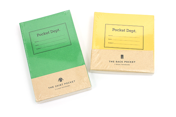
JetPens, a fantastic online shop with pens, pencils and paper galore, was kind enough to send me a couple varieties of the Pocket Department notebooks they stock: The Shirt Pocket notebook, in green, and The Back Pocket in yellow.

Pocket Department Notebooks

The Shirt Pocket

Pocket Department Shirt Pocket notebook

At a pretty standard 3.5” x 5.5”, The Shirt Pocket notebook is not sized significantly different than an aforementioned Field Notes cahier. It does indeed fit easily into a shirt pocket:

Pocket Department Shirt Pocket notebook in shirt pocket

I really like the design: the color, the simple font choice on the front and the plainness of the inside. I love that the lines on the paper match the green cover, and the paper itself is smooth. It takes anything from a pencil to a felt-tip fine liner perfectly (I didn’t try it with a fountain pen, I’m afraid).

Pocket Department Shirt Pocket notebook writing test

I have to admit, I’m not a huge fan of the binding. Instead of a saddle stitch like so many pocket notebooks do, they opted instead to make it perfect-bound. That results in a much cleaner spine and keeps it closed flat, but when you’re trying to write it in, it’s very tight and hard to hold open.

It seems like it’d be a great format to offer something Field Notes, Word., and other pocket notebook stationers don’t: perforated pages. I’d love to use this thing to scribble a note, and then tear out for later. Alas, it’s definitely not a perforated book.

The Shirt Pocket notebook is available in a pack of three for $12.50 at JetPens.

The Back Pocket

Pocket Department Back Pocket notebook cover

This was a fun one to review! At 4” x 4”, this perfectly square notebook is unlined, perfect for quick visual notes, a sketch, or just for writing words that can’t be contstrained to lines.

Pocket Department Back Pocket Notebook paper test

Oh, just so you know, I am the WORST at drawing. I should have given this to a more artistic friend to try out.

It has the same binding as the green notebook, but the size made all the difference — because there was more width to each page, it was much easier to hold open. I also appreciate the size in that I can flip the page up, like a reporter’s notepad, if I wanted to.

The Back Pocket notebook is available in a pack of three, also for $12.50 at JetPens.

Other Sizes

The Pocket Department has a couple other sizes that I’d love to try that isn’t unfortunately available at JetPens — There’s The Messenger Bag, sized at 8.5” x 5.5”, and The Backpack, at 6” x 6”. They’re not so much formatted for a pocket on a piece of clothing than a pocket for a bag, so they’re much bigger.

I found a website at PocketDept.com that seems to tease out different colors being available, like grey, white and a natural brown paper sack color, but the site is either broken or not entirely built yet.

All things considered, this is a fun little notebook series. I haven’t used it enough to tell how durable they are, but once I figure that out, I’ll definitely report back.

Find out more information about Pocket Department notebooks at JetPens.com.