Full disclosure: I do contract marketing work for CalCedar to promote Pencils.com and and the California Republic Stationers brand on social media. Though I am not being paid to write this post for Woodclinched (my personal blog), I’ll refrain from reviewing the performance of this pencil, past a few general statements about it.
So I was getting ready for work this morning; a dark gloomy day in Indiana, when my doorbell rang. It was the FedEx woman, she she was bringing me a package from Pencils.com! Suddenly, the sun came out, and the bird started singing!
Metaphorically, of course.

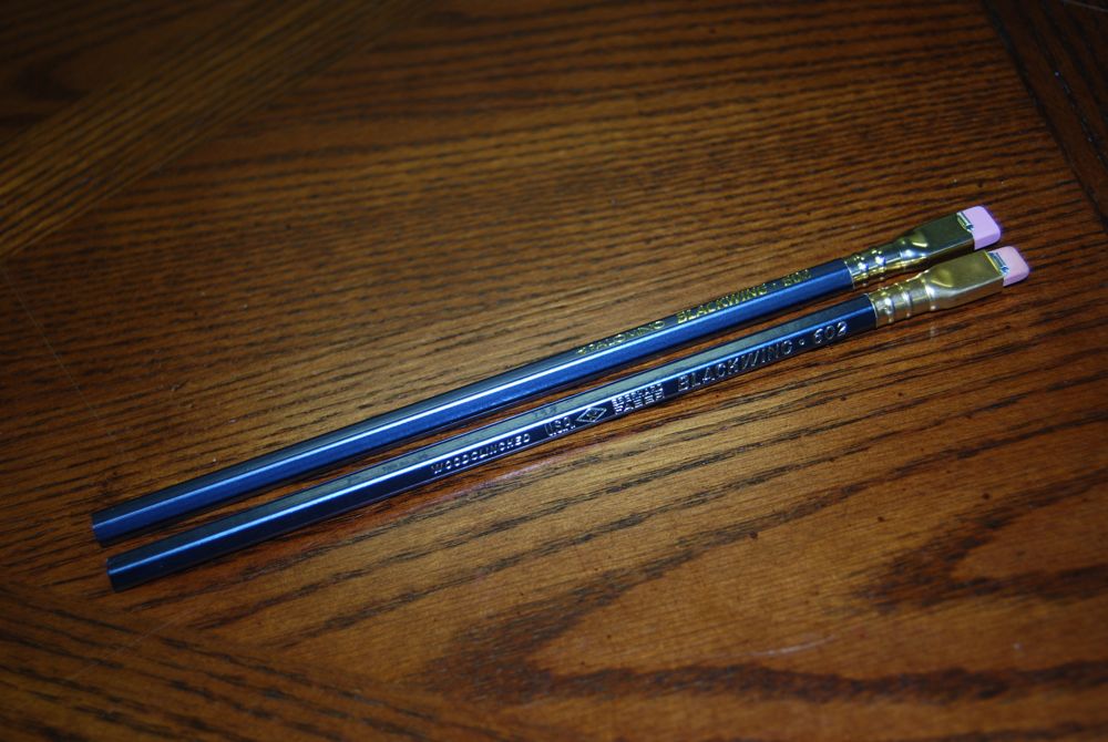
I opened it right up, and checked out the pencils. I didn’t have a lot of time to examine them, but I grabbed an original Eberhard Faber Blackwing from my desk drawer and one of the new Palomino Blackwing 602 pencils, and headed out the door.
Because Grant was kind enough to send me a pack of pink erasers, I popped one into the signature Blackwing ferrule, and took some side-by-side photos of the new 602 with the old.
So, without getting into details, it does indeed feel firmer than the Palomino Blackwing, but smooth and dark just the same. The real test will happen after Monday, when I’ll be in two or three meetings taking notes.
Here are a few pictures — as I’ve said many times, I’m not the best photographer out there, especially with something as hard to shoot as pencils.
Questions about the pencil? Leave ’em in the comments. Otherwise, check out the product page on Pencils.com!


Looks fantastic! I think I am being sucked in by the aura and need to try these out. 🙂
How does this new 602 compare to the original PBW and the Palomino HB in terms of crumbling? How’s the finish? I love the high gloss look and feel of the Palomino HB, but this new 602 looks like a thick paint finish unlike either the glossy Palomino, or the matte plastic coated original PBW.
It’s likely a toss up between these 602’s and a dozen of Hi-Uni’s for my next pencil purchase, so I’ll be watching for any follow up comments or reviews about this new Blackwing’s performance.
Brian,
I mentioned earlier I’m going to refrain from reviewing its performance, but I think I can talk about the aesthetics of it. It’s really similar in look to an original EF Blackwing. The ferrule is a bit less brassy than the original’s ferrule (it’s the same one used on the black PB). The lacquer, though, is spot on. At least compared to one of my EF Blackwings from, I’m guessing, the late 80s or early 90s (before they stamped “Faber-Castell” on them.) It’s really close.
Hope that helps! I’m sure some reviews of its performance will be coming shortly from some of the other pencil bloggers out there!
I am looking forward to getting my hands on my new 602’s (haven’t checked the shipping status on something so much since I ordered a new MacBook pro). My enjoyment of the current PBW combined with my love for that last EFBW I have in stock may make it difficult to give an unbiased review. I want to love these new 602’s. Let me reiterate, I want to love these 602’s.
It’s close.
I just received my first box (purchased) of the PBW602’s and think they are great. I want to commend CalCedar for a very respectable job and their commitment to the 602. Comparing the new 602 to the originals I have on hand, I will make a few comments. First, the paint color is very close, although I think the new version has a bit bluer tint in it (age of my original could be a factor here). As noted above the ferrule is a bit lighter in appearance and less brassy looking than the originals. Like the ferrule, the paint for the font appears less “brassy” in color on the new PBW602 than the originals I have (again, age of the originals makes this somewhat deceptive). The font on the new version is a bit smaller and slightly different, also. Most notably, the “602” on the new version appears blockier on the new version than the original EFBW 602.
Performance is always somewhat subjective, but I have to say this is what impresses me the most about this new release. I have just been using it for a couple of days now, but I think it is very, very close to the original. The new version may be ever so slightly darker (which is not a negative in my view). I happen to like CalCedar’s original version of the Blackwing, but felt it was a tribute to the Blackwing in name only, and not performance. The new PBW602, however, seems to be a true shot at duplicating both the look and performance of the original. And, I believe they have succeeded admirably. Is it a dead ringer? No, but its darned close and I will be buying more. Nice job, CalCedar!
Tim
Just got mine, and am playing with them right now. My first impression is that the PBW602 simply exudes quality when compared to the original PBW in terms of finish and design. It’s a much more refined pencil aesthetically. I also think the new PBW602 wears all the eraser color options pretty well. I’ll probably stick with black, but the white erasers look equally at home with the metallic gray. I was worried at first that the gray would be awkward with the golden/brassy stamping and ferrule, but it’s actually quite attractive in person. I think it’d be nicer if the imprints were a bit deeper, but they seem a good step up from the earlier version.
As far as the lead is concerned…I haven’t put it through much use yet, though it seems to be pretty good, and the advertising pretty accurate. My immediate thought was that it felt a bit softer than my HB Mono 100s and Hi-Unis, and slightly “chalkier” than the 2B and B variants of those pencils, respectively. I’ll reserve judgment for later when I have more experience with them, but the initial thoughts are positive overall.
Pingback: Review of Palomino Blackwing 602.
Turns out these kind of suck. I’d love to compare them to a vintage Blackwing but I’m not paying $100 for a single pencil. Saying they suck is a bit harsh, but it seems like kind of a con to make people pay what these cost when you could just buy any much cheaper 4B to get the same basic pencil. It seems a bit of a hipster thing – they want that weird looking ferrule and the phony association with the original Blackwing. The graphite formula isn’t the same. It’s just an approximation. I wish they could just make them with the equipment they used to make the original, with the same graphite formula – but of course all they bought was the Blackwing name.