“How I wish I may do it as gallantly as you:” A letter written in pencil to Dorothea Lange by John Steinbeck

Just across the bay from San Francisco is Oakland, a city that often lives in the shadow of SF, but has so many cool attributes in its own right.

On Sunday, I went to one of Oakland’s gems, the Oakland Museum of California. In addition to some amazing permanent installations, we saw a temporary exhibit featuring the photography of Dorothea Lange, a prolific documentary photographer from the early- to mid-1900s.

She’s perhaps best known for her series on the displaced farm families as they migrated from Oklahoma to California in the 1930s, and on the forced internment of Japanese-Americans by the US government during World War II.

(And among a certainly online community, she’s also known for having a Blackwing Volumes edition tribute — the red-ferruled Volume 344.)

The photography was powerful, the narrative was fascinating and there were really great interactive elements of the exhibit, featuring creative photo cropping, grouping photos to tell a story, and other immersive lessons.

A display featuring a letter written to photographer Dorothea Lange by author John Steinbeck in 1965. Displayed in the Oakland Museum of California.

But the piece that really held my attention was a letter written to her by John Steinbeck just a few months before her death in 1965. He thanked her for the use of her photographs for a collection of articles he wrote in a pamphlet called Their Blood is Strong, about the Great Depression and American migrant workers.

(If you don’t know who John Steinbeck is, I can’t help you. But let’s say for the sake of this article that he’s a guy who wrote books and is perhaps the most famous modern pencil user. He also has a Blackwing Volumes tributed to him — the all-black Volume 24.)

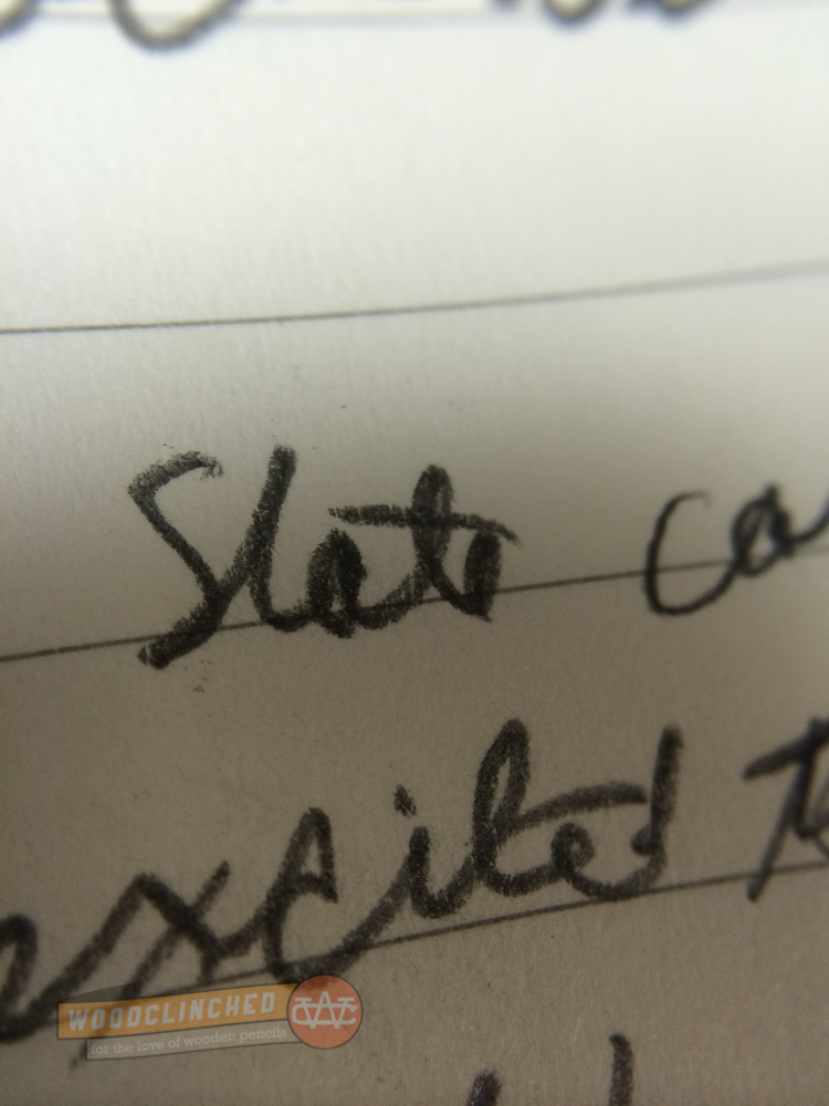
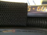
When I got up close to the display, I noticed that the letter was written in pencil! Its a bit hard to tell from this photo, but the marking is extremely dark. If Steinbeck was writing with one of his favorite three (the Eberhard Faber Mongol, the Blaisdell Calculator 600, and the Eberhard Faber Blackwing 602), I’d guess that it’d be the Blackwing.

(An Erasable group member put together a project called The Steinbeck World Tour, a collection of those three pencils that was mailed to participants, so they could experience them. I got to try them out in Spring 2016, and can speak from experiecne that the Blackwing is indeed the darkest and smoothest. Although the Blaisdell is pretty close.)

The Steinbeck Trio: three pencils lauded by Steinbeck.

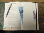
The Steinbeck Trio: three pencils lauded by Steinbeck, accompanied by a baseball card and an Field Notes pocket notebook with an Erasable sticker.

I love this quote from Steinbeck’s letter to Lange:

We have lived in the greatest of all periods. If the question were asked, if you could choose out of all time, when would you elect to have lived, I would surely say — the present. Of course we don’t now how it comes out. No one ever does. The story ends only in fiction and I have made sure it never ends in my fiction.

A transcript of Steinbeck's letter to Lange.

Notice how great Steinbeck’s handwriting was. It’s hard to believe, since he wrote so much by hand, that his pencilmanship didn’t degrade over time. But I guess when you’re writing a letter to one of “the giants” like Dorothea Lange, you slow down and take your time so your writing is legible. Even if you’re John Steinbeck.

Thank you to the Oakland Museum of California for the exhibit, and for giving me the opportunity to see this artifact of an  interaction between these two giants.

Two more Blackwing notebooks to complement the Slate

It’s been a minute since I’ve written anything about Palomino Blackwing/Pencils.com/CalCedar. But it’s not for want of any new products from them. They’ve been busy!

Their latest release is a great follow-up to my post in Summer 2014 about the Blackwing Slate, a Blackwing-branded A5-sized journal. Since that release, they haven’t said much about their line of paper products, though I’ve seen the Slate in most stores that carry their pencils. I figured they’ve been concentrating on their (very ambitious) quarterly Volumes releases.

But it was in the last Volumes release that they gave us a taste of what’s to come. The Volume 205 edition (the “jade” edition) included an extra. A small, single, pocket-sized notebook with the same leather-ish polyurethane black cover as the Slate.

blackwing-notebooks-1Later on, they announced it was called the Blackwing Clutch. And they followed that up with the Summit, a larger, 8.5 x 10” edition.

blackwing-notebooks-2
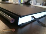
Like the Slate, the Clutch and the Summit are plain black with a creamy, thick paper. Unlike the Slate, they are perfect-bound with a contiguous cover from front to back, similar to a Write Notepad notebook. And they have a soft cover; similar to a Moleskine, though with a better, thicker cover.

One thing about both of these new notebooks was bugging me — the name. The “Slate” makes sense — it’s another name for a handheld writing surface. But what about the “Clutch” and the “Summit”?

Finally, I emailed Alexander, Blackwing’s brand manager and asked. He said:

“The ‘Clutch,’ because it will (hopefully) come in clutch when you have a great idea on the go, and because it opens like a clutch bag. The ‘Summit,’ because we envision this being more of a meeting/desktop/workplace notebook, and because it’s our largest notebook offering.”

(“Clutch,” for those of you who don’t know, is slang for “performs under pressure.”)

Aesthetics

blackwing-notebooks-iphone

I’m a fan of the matte black covers — they match my iPhone really well, so when my notebook and phone are laying on a desk next to each other, it looks like I planned it that way.

That said, I’m generally drawn to stationery items with a bit of color. The Baron Fig Three-Legged Juggler and the Write Notepads Kindred Spirit are two notebooks that come to mind.

But these are subtle and classic, and complement their pencils really nicely. Blackwing pencils are themselves not subtle (though I do think most of them are pretty classic), so unlike a bright pocket notebook (Say, the Field Notes Unexposed edition), these notebooks won’t draw attention away from them.

The Form Factor

One of the big advantages to the Clutch, Blackwing says, is to use it sideways, in “clamshell mode,” as it were. Two things about this:

  • That’s not a particularly unique value proposition — you can do that with any saddle-stitched or perfect-bound pocket notebook. And really, anything that’s graph or dot-grid ruled.
  • Also, the notebook isn’t particular good at being used sideways like that — the binding is very tight and it’s hard to break the spine on some pages.

Like other perfect-bound pocket notebooks, the Clutch is bound in such a way that in order to let it lie open, one must “crack” the spine —

bendy-blackwing-notebook
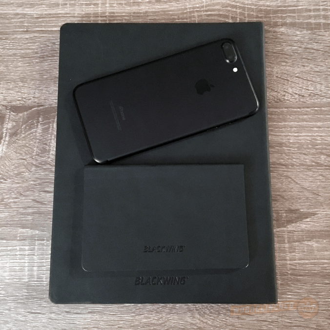
The Summit makes no such claims. The binding is a bit different — it’s more of a traditional journal, with the cover material tucked underneath the end sheet.

The Paper

Like the Slate, these two has a thick 100gsm ivory paper. It’s luxurious and smooth, but kinda smeary. I don’t know why I didn’t notice it in the Slate, but looking back, the Slate’s paper seems toothier. Check out the smear from this Blackwing Pearl:

smear-testAnd that’s not even the softest Blackwing out there.

Despite the smeariness, I like it a lot. It feels like paper befitting a luxury brand.

I am, however, not a huge fan of the dot grid here. It’s well-spaced — just about the same as the Baron Fig Confidant. But the dots themselves are big and bold, which makes them feel a bit intrusive. I would much prefer them to be smaller and lighter.

blackwing-notebook-7

The darker but smaller dot grid of a Blackwing Summit notebook next to the grayer but bigger dot grid of a Baron Fig Confidant

Both the Clutch and the Summit come in dot grid, lined and blank (the latter two I haven’t tried).

The Price

This is where you really see what “luxury brand” means. Like their pencil counterparts, this is not cheap. A three-pack of the Clutch notebooks are $14.95. The Summit is just a dollar cheaper than the Slate, at $21.95.

Is it worth it?

This is something you’ll have to determine for yourself. For me? It’s worth the quality they put into the notebook. They seem way more sturdy than the $12-per-pack Field Notes (only time will tell, though).

However great the quality is, I still would prefer a bit of color in my notebook. The Baron Fig Confidant and Vanguard limited editions are great for me in that regard, as are Write Notepads’ pocket notebooks. The Blackwing notebooks don’t appeal to me, aesthetically, as much as they do. If you like a subtle, classic black, I wholeheartedly recommend them.

I will certainly keep coming back to Blackwing for pencils, though. My Volumes subscription renews in a week, and that’ll be the start of my third year as a subscriber.

Check out the Blackwing Clutch at Blackwing602.com. And the Blackwing Summit. And if you haven’t seen it before, the Blackwing Slate is the hardcover journal sized right in the middle.

And thanks to Blackwing for providing me a pack of the Clutches and Summits at no charge for review purposes.

Let’s bring women and people of color to the Blackwing Volumes editions

Last week, I traveled to beautiful Vancouver for the Design & Content Conference. In addition to enjoying the city immensely (and visiting an incredible stationery store: Paper-Ya), it was one of the best conferences I’ve attended.

In an industry where workers look mostly like me (white, male), the speakers and subject matter during the conference was strikingly diverse. We had all-women discussion panels, and at least half (and maybe more) of the speakers were people of color.

We talked a lot about diversity and inclusiveness, too. Several panels were about designing software and web interfaces for diversity, crisis and stress-cases, and I came out of it amped to make sure the stuff I work on works for everyone; not just for those I’m most familiar with.

It made me think about the communities I’m a part of, and where I exert the most influence. It occurred to me that it might not so much be the tech community, but that the stationery community (while smaller, perhaps) is a place where my words and thoughts may have the most impact.

Because of that, I was energized to read a fantastic observation made by a Melissa Chapin, an artist and active member of the Erasable community on Facebook , about something that I’m embarrassed I’ve never noticed: that all five of the Blackwing Volumes editions are tributes to white men.

We have the 725, modeled after Bob Dylan’s guitar; the 211, a tribute to John Muir; the 1138, a movie reference to a George Lucas film; the 24 for John Steinbeck; and most recently, the beautiful be-Yankeed Volume 56 for Joe DiMaggio.

These are all fantastic tributes, and I love the story behind them. But they represent just one demographic of those who made history. What about a pencil that Blackwing fans who are women, or people of color?

I’d love to challenge and encourage Blackwing to consider that for their next edition, or better yet — next several editions.

Here are a few ideas that I’ve been thinking about that would be absolutely amazing:

  • backwing-tributesVolume 11.8: The Grace Hopper Science Edition — named for the distance, in inches, that light travels in a nanosecond. Admiral Hopper was known for using lengths of wire this long as visual aids in her talks about satellite communication technology.
  • Volume 1940: The Hattie McDaniel Film Edition — named for the year this actress became the first woman of color to win an Oscar, for her role as Mammy in Gone With the Wind. It would be another 62 years before it would happen again, in 2002 for Halle Berry.
  • Volume 45: The Jesse Owens Sports Edition — This African-American Olympic runner broke three world records and tied a fourth, all in 45 seconds.
  • Volume 70: The Ibrahim Ferrer Music Edition — This amazing Cuban singer gained renown later in life after he joined the Buena Vista Social Club at the age of 70.
  • Volume 35: The Frida Kahlo Art Edition — This is the number of surgeries she suffered through in her life, after polio and a bus accident. The constant pain she felt informed her iconic art work.
  • Volume 135: The Ralph Ellison Literature Edition — This is named for the street he moved to in Harlem in 1936, where began his career as a novelist.
  • And finally, how about Volume 11: The Harvey Milk Politics Edition — The first openly gay publicly elected official served 11 months in office before he was gunned down in the streets of San Francisco for his pride and bravery. (OMG, a rainbow Blackwing?!)

I don’t want anyone to think that I’m finger-pointing or declaring Blackwing to be racist or sexist. They’re creative professionals who build amazing products I use everyday. And, like me, they are inspired by heroes to whom they feel a connection. It’s pretty natural to find connections most strongly with those like yourself, and because society more loudly applauds white men for their skill and accomplishments, it’s not surprising that the five editions so far represent creative inspiration from this group.

In researching these icons of history and literature, and discovering the numbers that run through their lives, I was inspired by how vast a field of candidates could be for a Blackwing tribute. Others in the group suggested editions named for Amelia Earhart, Toni Morrison, Susan Kare, and more.

What great women and people of color inspire you? Where would you find the number for their edition? I would love to hear it, and I’m sure Blackwing would as well (though I hope and suspect they have some great ideas of their own).

Thank you, readers, for letting me opine, and Blackwing: thanks for being good sports and stepping up to inspire all of your customers, not just those who look like me.

The Blackwing Slate: The pencil-optimized notebook

It’s a really exciting day today, folks. It marks the ninth anniversary of my friend Johnny Gamber’s first pencil review on Pencil Revolution! He wrote about Pencils.com’s ForestChoice pencils.

It’s speculated by Pencils.com’s Fearless Leader (and CalCedar president and CEO) Charles Berolzheimer, this is the first pencil review, ever, on the internet. (And to celebrate that, Pencils.com is having a one-day-only sale on ForestChoice products — 25% off!)

Congratulations, Johnny! Long live the Revolution!

Blackwing Slate

Yesterday marked the first day the Blackwing Slate was available for purchase. If you get emails from Pencils.com, or have been reading the blogs at Pencils.com and Blackwing602.com (there’s a lot of websites nowadays in this franchise), you may have seen teasers for this product. It’s a Moleskine-like notebook, but improved for co-branding with the Palomino Blackwing. And, in my opinion, way nicer than a Moleskine.

It seems that the devil is in the details with notebooks nowadays. The Baron Fig, reviewed here back in April, excelled in the little design choices that set it apart from its rivals. The same thing applies to the Slate — there are numerous little improvements that really make it stand out.

The Exterior

Its size is quite similar to the Palomino-branded journal line at 5” by 8.25”. The cover is a bit thicker and softer,though, and very matte — more of a shark skin feel to the harder, shinier Palomino hardcover. I’m not sure about this softness — I hope that it means it won’t scratch easily. Only time will tell. Besides that, it’s quite nice to touch.

Blackwing Slate Cover Closeup

It has a really nice thick elastic loop on the spine for a pencil, which is a great feature. This isn’t a dinky little piece of elastic either — this thing looks like it’ll hold its stretch for years.

Blackwing Slate Spine

Speaking of spines, the really innovative thing (in my opinion) about the Slate is the spine. because there’s a pencil strapped close to the spine, the two thick covers stop at the edge, and then are bound together with a substrate (I think I’m using that word correctly here). Essentially, the spine is reinforced, not with an extension of the cover board, but with the cloth that binds the cover to the signatures of pages inside.

It results in a very flexible cover — the first time I opened it, it wasn’t stiff at all. And I can even open it with the pencil still in the loop, which is great. It seems like it might make the notebook less durable — if the cover’s not protecting the spine, will it tear easier? Again, time will tell.

The Paper

Writing in the Blackwing Slate

Man. I love, love this paper. It boasts a 100gsm paper, compared to the Palomino luxury notebook’s 90gsm and Rhodia’s 80gsm paper. It’s so thick and plush, you guys.

It’s available in both lined and plain. Since the guys at Pencils.com know I am not an artist, they sent me a lined one to try out. The grey lines are set apart 0.25” on an off-white paper. The paper is smooth, but not as smooth as Rhodia paper. It has a little tooth on it, specifically engineered — I hope — for pencil. It’s the perfect amount to grab your graphite but still feel smooth.

Closeup of Palomino Blackwing 602 writing in Blackwing Slate

I tried it out with a medium-nib fountain pen, just to see how the paper held up to ink (though it would be sacrilege to use anything but pencil in this notebook!), and it worked great! No bleeding of note at all on the opposite page.

Closeup of a medium-nib fountain pen ink in Blackwing Slate

The opposite page from the fountain pen wriiting. As you can see, there is virtually no bleed-through! This is some thick paper.

The opposite page from the fountain pen writing. As you can see, there is virtually no bleed-through! This is some thick paper.

The Details

Besides the spine, this is what really gives the Blackwing Slate its distinction, and contributes greatly to those details I mentioned earlier. It has all the Moleskiney amenities, but all a bit nicer than the Moleskine’s — a satin bookmark, an elastic strap to keep the cover closed, a paper pocket in the back to hold stuff.

There are two different pockets in the flap in the back!

(That pocket is interesting — it’s actually a double pocket, with a small flat on the front for small things like, say, a driver’s license or credit card, and a wider one behind to hold things slightly smaller than the cover)

It even comes with a shiny new Palomino Blackwing 602 pencil tucked in the pencil loop on the spine!

It’s the details.

The Price

The Slate sells for $22.95, a full $9 more than a Moleskine Classic notebook sells at Barnes & Noble. The included pencil is worth about $2 of that price, so at $20.95, is the notebook worth it?

Depending on a lot of factors, of course, in general, I’d say that yes, it’s worth it. I’m not trying to bash Moleskine here (we actually had a discussion on the most recent episode of Erasable about how it’s become fashionable to look down on Moleskine), but the Slate is much better constructed, the paper is so much heavier and nicer, and for a pencil user like me, that elastic loop on the spine is wonderful.

Go check it out!

The Blackwing Slate | $22.95 at Pencils.com

Disclaimer: This product was sent to me, free of charge, for review purposes. No monetary compensation or additional direction was provided to me.


The Woodclinched Pencil Vector Pack

My friend Tony Headrick is a super talented designer. His studio, Neno Design, has won design awards and he’s created some of the coolest logos and websites around Fort Wayne (including my blog’s logo!).

We decided we wanted to work on something together. Trouble is, I’m not a designer, and he’s not a writer. Luckily, we figured it out.

Presenting: the Woodclinched Pencil Vector Pack!

Woodclinched Vector Pencil Pack

It contains 14 pencils from my collection, some vintage, and some new. I tried to include a variety — including an old bullet pencil and a fancy antique mechanical pencil — in addition to straight-up wood cased pencils.

Roughly, here’s what real-life pencils the designs were inspired by, from left to right:

  • Faber Castell Grip 2001
  • Yikes! triangular color pencil
  • Field Notes pencil
  • Goldfish Special Drawing 5002
  • iTO Premium
  • Golden Bear
  • Eagle Flash 66
  • Orange Palomino (the old-style — the announcement of the redesign was announced while Tony was designing!)
  • Antique brass mechanical pencil
  • Eberhard Faber Blackwing
  • Antique bullet pencil
  • Yikes! Gripz
  • Blue eraser-tipped Palomino
  • Draplin Design Company carpenter pencil

It was fun hearing Tony talk about creating these:

To me, pencils are one of the most accessible and basic art tools. Working with Andy Welfle, a professional pencil collector, made the experience so worthwhile. Andy provided some of his favorite pencils, the history behind the design and it was a real privilege to be trusted with such unique, vintage and storied pencils. It was a real challenge to try and keep the design minimal. The colors, materials and textures were what really stood out.

Just look at the detail between various lengths o points, and of the sharpening of the barrel between round and hex pencils.

Just look at the detail between various lengths o points, and of the sharpening of the barrel between round and hex pencils.

He did an amazing job, too. As someone who doesn’t normally spend a good portion of his day thinking about wooden pencils, he caught a lot of detail: how a hex pencil differs from a round pencil where the tip meets the paint; how the shape and tip of a carpenter pencil differs from, say, a regular round pencil; the shine pattern on a ferrule or a tipped end. From a design perspective, I love how he managed to keep the design pretty flat and basic, but was able to incorporate a lot of detail, still, like the woodgrain and that shine on the barrel.

What is a “Vector Pack”?

What does one do with a vector pack, all you non-designers may want to know? If you’re a designer, or find yourself in a situation where you may want to use a pencil like this in a design, then this might appeal to you. Rather than a raster like a JPEG or a PNG, a vector file allows you to scale an image up or down infinitely, keeping its shape and integrity all the while. Plus, you can easily change color, add text, or otherwise manipulate your image to fit the needs of your project.

This pack exists in a few different forms:

Free Vector Pack

Sample pencil pack on Dribbble.

Sample pencil pack on Dribbble. Click the image to view

Check out Tony’s Dribbble page for a sampler of six pencil vectors. Some of my favorites aren’t in this package, but if you want those, check out the…

Full Vector Pack

Click the image to go see the full vector pack at The Creative Market, and purchase for only $5!

Click the image to go see the full vector pack at The Creative Market, and purchase for only $5!

This includes all 14 pencils and is for sale for $5 on the Creative Market!

T-Shirt

Woodclinched Pencil Vector Pack on a t-shirtThis is coming soon. I’ll definitely have more information when we get this up and going. We’re going to submit it to The Cotton Bureau to crowd fund the printing of these t-shirts.