I got an email last night that had some interesting and welcome news — the Palomino pencil got a brand refresh! At least the drawing pencils did. Just look at this:
 The “Palomino” brand has gotten a lot of play since the restarted Blackwings have been co-branded with the little California horse, and then later, a few other Pencils.com pencils shed their “California Republic” brand to join up under the Palomino name.
The actual Palomino pencil, however?
It hasn’t changed much at all. In some respects, that’s a good thing — it’s a really great pencil as it is. Formerly the high end house brand offering from Pencils.com (before the Palomino Blackwing came along), it’s still the best utility pencil they offer. When I worked there, but briefly, the mixed-grade Palominos were lauded by art-school professors and drawing professionals all over the west coast.
The new design direction
This redesign makes logical sense when you see some of the newcomers to the Palomino brand. Here are some of the changes to this pencil:
- The signature orange color (though I love, LOVE the blue alternates) has been updated a bit is still the same (See Charles Berolzheimer’s comment below — I swear that orange looks different than the old model). I haven’t seen it in person yet, but from the photos online, it looks like there’s a bit more yellow in the orange to match the spine of the Palomino-branded notebooks. Previously, the pencils’ orange were a bit more red.
- It’s now capped by a black tip bordered by a white stripe, calling to mind a Mars Lumograph pencil by Staedtler.
- The labeling is a bit higher contrast, with the core hardness written in white on the black tip, and the branding in black on the orange barrel. Gone are the days of the gold foil stamp!

My trusty blue, old-style Palomino. I’d love to see the refreshed product line get a blue alternate color, too.
These updates really give the pencil a European look and feel, and showcases it as a high quality pencil, without screaming it like a Blackwing. I really liked the gold foil on the old pencils, especially the little gold stripe near the tip, but I definitely get where they’re going. This makes for a much more cohesive brand.
No word on performance, though I would assume it performs as well as the old one. Which is fine with me!
(That reminds me: have I ever actually reviewed a Palomino on this blog? I don’t think so. I had one at the PencilThings blog. (While the site is still up, the blog been lost to the annals of time and poor database management.) Maybe it’s time to put them through their paces again.)
Pricing and availability
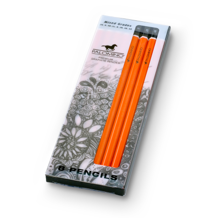 The Palomino is available for the same price as before; $12 for a dozen in the same grade or $10 for a mixed-grade set of eight, ranging from 2H to 6B (excluding 3B and 5B, but including an extra HB pencil).
I need to buy a new long point sharpener after my old one broke (don’t ask), so I may pick up a dozen of these, too. I want to check out the mixed grade drawing set, but I’m definitely not someone whose drawings are intricate enough to involve more than a single grade.
 While I’m on the subject, the Pencils.com brand has itself been updated! The logo now cleverly turns the “il” from “pencils” into a pencil. The website was relaunched with a cleaner, responsive design, and the blog formerly known as “Studio 602” has been refined and rebranded as The Pencils Blog.
I leave you with this short video: Alexander from Pencils.com posted an “unboxing” video. Usually reserved for new electronics, usually Apple products, I love that it’s been applied to pencils:

Thanks for the love Andy! I’m glad to hear you like the new site and the new pencil design. Shooting that unboxing video was definitely an experience, but it was actually pretty fun!
I bet, Alex! When I did that video about how to use the Palomino Long-Point sharpener, it was a big ol’ challenge. And that didn’t even do HD! Kudos!
Andy, Thanks for the post. Just a couple points of clarification. The redesigned orange Palomino pencils retain the same orange color as prior versions as well as the same premium quality Japanese graphite. We considered printing this pencil with the name “Palomino Premium Drawing” or “Palomino Original” to distinguish it’s graphite performance from that of the Golden Bears and Prospectors which are now also branded as Palomino. In the end we opted for simplicity in look and design. The movement away from gold foil stamp was a matter of cohesive styling given the change to white grade stamp on black end for purposes of improved grade visibility in response to feedback we had been receiving from artists using these pencils. For now at least we still retain the gold foil imprint on the Palomino HB eraser tipped pencils for general writing purposes. Not sure of the fate of the Blue HB eraser tipped and end-dipped versions at this point.
Thanks, Charles! That’s good to know. I will indeed update the article about the orange. And thanks for the feedback on the other points. I’m glad we have some insight into the design process!
OMG, please don’t discontinue the blues. They are one of my very favorite pencils ever. If you DO change the eraser-tipped models, would you do a black ferrule, to match the new ends?
Some thoughts:
1) The Palomino 6B is one of my favorite pencils ever. Charles, please don’t ever change the lead. It is super smooth and super dark for graphite.
2) The original Palomino design is near iconic. The redo will have to grow on me…
3) …Wait! Is that a barcode I see in the video stillshot!? I’m sorry, but yuck. Unless the new
Pals are going to be sold individually at point of sale, I fail to see the reason for this disfiguring commodification of what is intended as an artist’s pencil.
4) Perhaps it’s just the photo, but the orange does seem flatter. If it is the same color, is it less thickly applied?
5) Palomino blue is a smashing color and it would be a shame to lose it.
6) I highly approve of the new Pencils.com logo. Whoever transformed the ‘ i ‘ and ‘ l ‘ into a veritable pencil deserves some extra grickle in their end-of-year pencil bonus cup.
7) Charles, any chance of seeing a premium branded Palomino block eraser?
Pingback: Link Love of Epic Proportions! | The Well-Appointed Desk