Edit 10/04/17: The Paper Tasting packs are now live and available on the Yamamoto Paper Etsy shop! It looks like they’re selling for just over $11 each. Check them out here.
A few weeks ago, I went to the San Francisco International Pen Show. Graphite representation was pretty low, but I was excited to hang out with some stationery blogger friends, like Ana Reinert from the Well Appointed Desk, and Brad Dowdy from The Pen Addict. In fact, I worked a shift at his Nock Co. booth, peddling fine nylon pen and notebook holders.
I also met a really interesting guy — Taizo Yamamoto. He was visiting the US, and is sort of a Japanese counterpart to me and other US stationery bloggers — he has a podcast about stationery (called Hoji-raji, literally translating into to dig up, as in digging up interesting and backgrounds of stationery industry people), focussed on paper. (It’s all in Japanese, so I’m sad I can’t listen to it). Our mutual friend, Bruce Eimon from Think on Paper Co., introduced us (you may remember Bruce from my post about the Mitsubishi Uni Palette).
Taizo and Bruce collaborate on a really cool product called Paper Tasting, which is really what I’m here to talk about.
What is Paper Tasting?

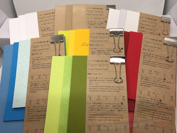
Paper Tasting pack “Yellow, vol. 1”
Well, it’s a sampler of different kinds of papers, organized in an expertly and tightly curated selection. It includes three samples of paper arranged in a theme — generally by color.
There seem to be, generally, three kinds of paper included in these packs:
- A small pad of thick, plush, extravagant paper
- A medium-sized pad of a more conventional, but still gorgeous, paper
- A larger pad of a thinner, vellum paper
But what is Paper Tasting, really?
To me, each pack seems like a celebration of the visual and tactile capabilities of paper. Bruce and I have a sort of ongoing conversation about the Japanese philosophy around paper — they place a much higher regard on texture and thickness than US companies often do, which focuses more on ruling and economy.
In fact, check out this brilliant taxonomy of paper that’s included in each Paper Tasting pack — they have 64 varieties of paper organized neatly for easy reference:

Paper Tasting’s Taxonomy and Classification of Japanese Paper
It took me some time to feel comfortable writing on this paper, because it looked and felt so precious — and because it feels like a limited resource. (Some of this paper just isn’t made anymore. The speckled “Paradise” paper from the “Blue, vol. 1” pack, for example, was discontinued earlier this year, which is a tragedy.)
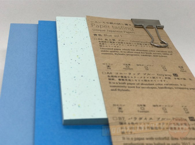
Paper Tasting pack “Blue, vol. 1”
What do I do with these Paper Tasting packs?
If you’re like me, they’re perfect for just looking at and playing with. There are so many more unique colors and textures in these packs than I’m used to seeing in one place.
And if you want to tear them off, fold them up and try out different pencils, pens, markets and other utensils on them — go for it!

Yellow Kaguya paper, embossed to look like the surface of the moon. From the Paper Tasting pack “Yellow, vol. 1”
I was lucky enough to get to try these packs out before their launch — according to the website, they’ll available for sale starting October 1. I’m not sure of the price, or how often they’ll be releasing new packs, but be sure to follow them closely.
And if you can get your hands on the Blue, vol. 1 and the Yellow, vol. 1 packs — do.
Find more information about Paper Tasting packs here, and check back in October for information on how to buy them. And thank you, Bruce and Taizo, for the preview!


 Later on, they announced it was called the Blackwing Clutch. And they followed that up with the Summit, a larger, 8.5 x 10” edition.
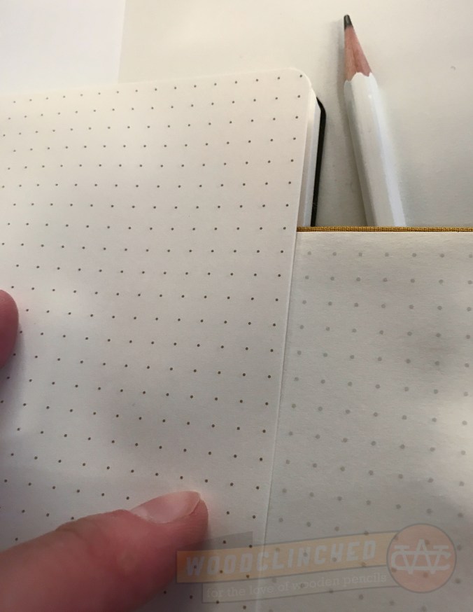
 Like the Slate, the Clutch and the Summit are plain black with a creamy, thick paper. Unlike the Slate, they are perfect-bound with a contiguous cover from front to back, similar to a Write Notepad notebook. And they have a soft cover; similar to a Moleskine, though with a better, thicker cover.
 The Summit makes no such claims. The binding is a bit different — it’s more of a traditional journal, with the cover material tucked underneath the end sheet.
 And that’s not even the softest Blackwing out there.