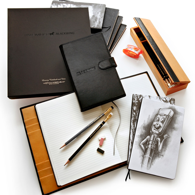
As a follow-up from my post last week about the Palomino-branded notebooks, I just ran across these photos from Studio 602, the Pencils.com blog, featuring paper products to compliment the Palomino Blackwing, the Palomino, and the ForestChoice line. Click to embiggenfy. These are perhaps my favorite, at least judging by the photos. It looks liek there’s a leather 5.5×8.5 clasp notebook, maybe an oilskin, Moleskine-style notebook, and some kind of cahier of unknown cover material with some illustrations on it. That Blackwing-man illustration was done by a very talented pencil artist Mogodore J. Bivouac when I worked at Pencils.com. I’m glad to see it gracing the cover of a notebook!
I’d love to see something with a sharkskin blue-grey color like the PB 602s, as well — the jet black looks dashing with the black PBs, and though it looks good with the 602s, a matching grey leather would be really cool.
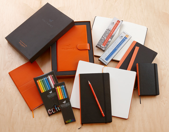
 This is the Palomino-branded line, with much the same — a clasp notebook, some Moleskiney things, and some cahiers, it looks like. What really stands out to me in this picture is the tall, skinny notebook directly underneath the single, orange Palomino pencil: it looks like it’s a narrower size than a standard 5.5×8.5 notebook. Maybe something like 4.5×8.5? This is purely conjecture, as this photo’s perspective could be off.
In any case, it looks really nice. As I’ve said before, it’s hard to do a black-and-orange brand without it looking like it’s Halloween-themed. Rhodia does it well, and I think this product line has captured it too.
I’m a big fan of the blue Palominos; it’s one of my favorite shades of blue, and the white eraser looks great perched atop the barrel. I would love to see a blue notebook, too!
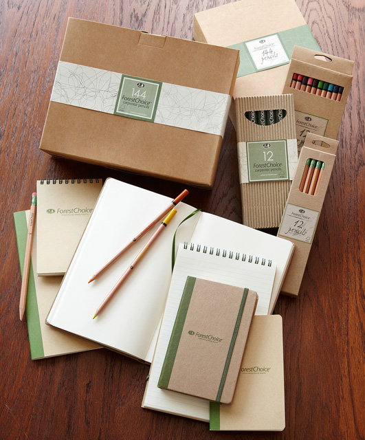
 That CalRepublic product that I’ve maybe used the least are the ForestChoice pencils. It’s not that I don’t like them, it’s just that when faced with the thick, glossy, colorful Palominos or Golden Bears, or the superior-quality Palomino Blackwings, these envrionmentally friendly cousins take a backseat, at least in my pencil box. Nothing personal, ForestChoice.
These are interesting, and perhaps the closest match as far as branding look-and-feel between the pencils and paper products. Those little notebooks with the elastic band look like something you could get at Target (that’s a compliment! Really!).
What I like the best from this photo is the tall, skinny steno pad, almost the shape of a reporter’s notepad, which I used for years throughout college in my journalism classes and working at a local paper. I would use this pad quite a bit, for notetaking at meetings where I am standing up, for shopping lists, to-do items, etc. It looks like it’s a bit more everyday-functional than the other lines.
In any case, bravo, Pencils.com! I can’t wait to see this in real life (or IRL, as the kids say)!
What’s next? This may never happen, but I’d love to see a Golden Bear or Spangle line of notebooks for school that may be just a smidgen higher quality (and higher cost) than a Mead notebook. Or perhaps a line of hand-erasers or more sharpeners akin to the Palomino KUM long-point sharpener.
What do you think of the photos above?
I might “need” to try some of these out.
Hey Andy – just ‘discovered’ these guys yesterday — you probably already know about them…
http://fieldnotesbrand.com/ (by the http://coudal.com/ group)
I’m seeing a beautiful pencil & paper synergy! : )
I have to say that I am a bit disappointed with the look of the Blackwing folio, especially what seems to be the magnetic clasp and the not very subtle branding. It looks very corporate. Will only the Blackwing notebooks fit? Is there a slit at the top to allow for the insertion of a writing pad, like a Rhodia? Altogether it feels very far from the artistic or literary aura of the original Blackwing. I can’t see Thomas Wolfe or John Steinbeck using these folios. I think that CalCedar has to stop and really examine what the original Blackwing aesthetic was and try to remain faithful to it as much as possible. Otherwise, Blackwing becomes just another brandname to slap onto anything black…And those Bivouac drawings, with all due respect, are corny, a far cry from the stunning graphic design that graced original Blackwing products (see photos at Sean’s Blackwing Pages!). It is wonderful of CalCedar to try and resurrect the Blackwing, but if they keep departing from the original look and spirit, Blackwing will become diluted and nothing but a name.
Adair, that’s some really good feedback — I plan on getting my hands on some of this product and can present more fully when and if that happens. Meanwhile, I’ll see if I can pass this along the appropriate channels. Although I am not employed or contacted by CalCedar, I still like to stay in pretty regular communication with them.
Pingback: Review of the Pencils.com Palomino-branded hardcover notebook | Woodclinched