An inky review of the Baron Fig Squire

Guys.

Hold on to your hats — you’re about to see a pen review here on Woodclinched. And it’s not a pen that’s arguably a pencil, either — it’s a real, for-sure rollerball ink pen.

I don’t do it lightly, though. It’s definitely relevant to my personal interests, and hopefully to yours, too.

Last week, I got to try out the Baron Fig Squire pen, Baron Fig‘s latest, and massively successful, Kickstarter project.

I was in New York City last week, and I got to hang with some pencil friends. I went to CW Pencils, of course, to see Caroline and Caitlin, and saw my good friend (and Erasable group member) Harry Marks. I also had brunch with June Thomas, who is a listener and active group member, and a journalist and podcaster herself.

AND, I managed to take the N over to Queens to see Joey and Adam at the Baron Fig studio.

We were planning this visit anyway, but it just so happened to take place a couple days after Baron Fig’s Kickstarter launched for the Squire — a new custom-designed rollerball pen. Being the curious person that I am, and them being the passionate, generous guys they are, they let me try it out.

So here it is, folks — the first-ever pen review on this blog, and the first-ever review of the Baron Fig Squire.

A word about the photos

Adam and Joey are obsessive about getting the details right. As soon as I whipped out my iPhone to take some pictures of the pen and the writing, they cringed. So I let Adam take some DSLR pictures of me writing with it, which are included with this review. These may be the best original photos ever displayed at this blog; as Adam is a WAYYY better photographer than I, by a few orders of magnitude.

The Squire’s aesthetic

Since the Kickstarter just, um, kicked off, I’m not sure if the pen among a few advance prototypes that I was using will be the final product. It’ll be hard to match that level of detail, though — the anodized aluminum of that pen body was great. It reminds me of the little iPod Minis from several years ago that came anodized in several colors.

Baron Fig’s will be available in silver and a darker charcoal color. I originally favored the charcoal, but I think Joey convinced me to go with silver. It’s gonna look so good with the base color of Confidante and my MacBook.

(I know, I know. That was a ridiculously hipster thing to say. I heard it too.)
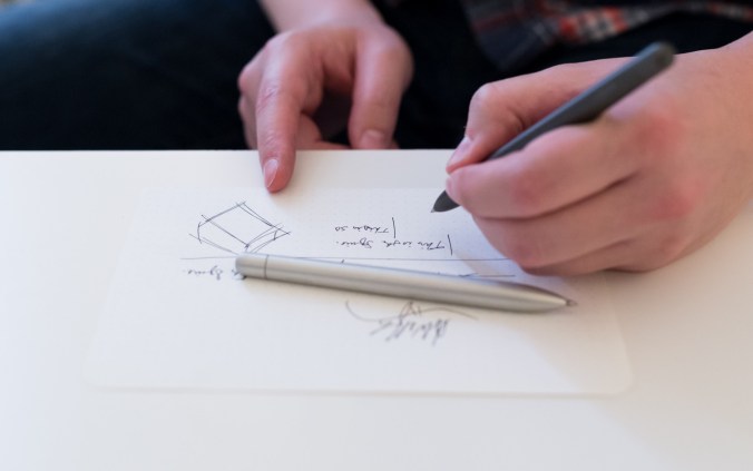
The body of the pen has a slight tapering to the back, so as to be shaped sort of like a long, subtle torpedo. The shape reminds me a bit of a nib holder for a dip fountain pen, which is a pleasant experience.

The length is also pretty great. At five inches long, it’s somewhere between a regular-size pen and a “pocket” pen. If this was a wooden pencil, we’d say it was at the “Steinbeck Stage,” or the point in which the back of the pencil hits the webbing of your hand between your thumb and index finger — John Steinbeck’s sweet spot for pencil length.

The Squire’s performance
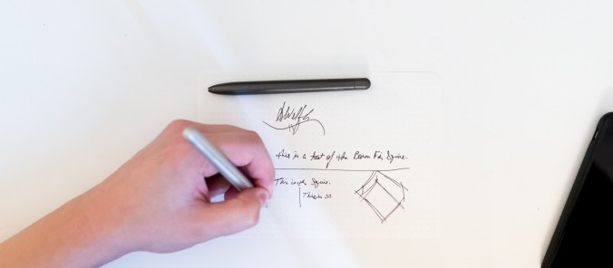
It feels weird for me to rate the way the Squire writes — it uses a Parker-style refill, so presumably it writes like any other pen that uses that refill, right? (I’m totally open to any more experienced pen reviewers out there educating me.)

In any case, it writes smooth and dark, like most fine rollerball pens. The tip, if I recall is 0.6 millimeters, which is just great for me. I know a lot of 0.38 millimeter fans other there that think it’s just a little too blunt for their purposes, but I don’t care. It’s still a finer line than most fountain pens, and didn’t skip a bit.

However, I want to dig a little deeper into the performance that the pen body itself gave — the part that makes the Squire unique to Baron Fig.

It’s well balanced, as they demonstrate in some of their marketing materials, and it feels great in my hands.

(While I’m generally a wooden pencil user, I do have some nice fountain pens in my possession that I occasionally use. It feels like that, though I can grip further down on the barrel than with a fountain pen. In pencil terms, it’s a medium-length point instead of a long point.)

The top end of the pen twists to advance the pen’s tip. It was a bit hard at first to turn — Joey’s been carrying around a prototype for a few months now, and in that pen, it twists much more easily, and has a satisfying terminal click once it reaches the end of the process. He thinks — and I agree — that it should wear in a little bit with time, like quality leathergoods.

The only criticism I can offer in the pen’s design is the lack of pocket clip. That’s the primary method through which I carry my pens, probably because I’m a big dork.


The thing is, though, that I completely understand the design choices that they made with excluding a clip — it’s so, so simple and clean. It’s akin to Apple’s very deliberate choice in excluding the floppy disk drive from the iMac, or the optical drive in 2011-on-model MacBooks, or the USB port from the latest MacBook models. They’re stripping it down to its barest essentials, focussing their efforts on designing the core product, aspiring to letting it do what it does very well.

The pen is no different. It writes. It’s a pleasure to hold in your hand from any angle, which a pocket clip might detract from.

I didn’t get to take the advance sample home with me, which is all right. I already pledged for one plus a limited edition Confidante that bears the little sword logo for the Squire. It was an honor enough to be able to try it out!

As a departing gift, the guys gave me a pack of the “studio edition” of Apprentices — available only to those who go visit their studio. The notebooks inside are wine red, bookmark yellow, and their signature neutral grey — all colors that recur in their branding and product design.

How to get your Squire

At the time of publishing, the Kickstarter campaign is 573% over goal, at $86 thousand. For $50, you can score a pen, in silver or charcoal. For $20 more, at $70, you’ll also get a limited edition Confidante, their signature notebook, with a special little Squire logo on it.

Check out the campaign, here.

A review of the Palomino Blackwing 725: the inaugural Volumes edition

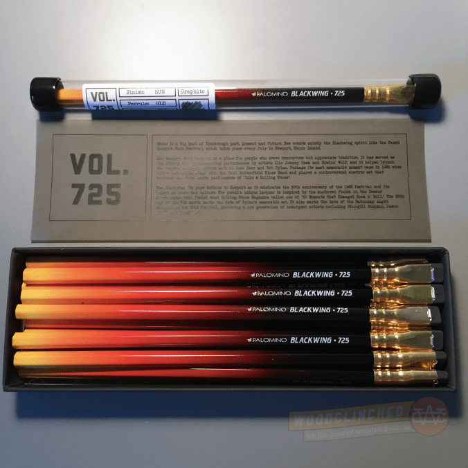
Yesterday was a big day! After I got home from a design lecture at Facebook (featuring Aaron Draplin!), there was a package waiting for me. It was just a plain, padded manila envelope, but the big words at the top of it made me so excited: “PALOMINO.” My first Blackwing Volumes subscription had arrived!

NUMB3R5

Last week, Palomino teased the edition through social media with a tiny nugget about the edition. It was simply a three-digit number: 725.

I posted in the Erasable group with some of my theories about what that number means. Most of my ideas centered around the idea of “725” being a model number, like how the Eberhard Faber Blackwing was “602.” Thanks to Bob Truby’s amazing site Brand Name Pencils and a quick search for “725,” I came up with a few great pencils:

Wouldn’t it have been fun if the Blackwing was sapphire blue like the EF Sapphire?

It’s all right, though. The actual reason for the 725 is much more interesting and true-to-brand for Palomino and their arts and music-centric interests.

A Pencil inspired by a guitar

Here’s why this sunbursted pencil bears the number 725, according to product page on the Blackwing website:

The Blackwing 725 pays tribute to Newport as it celebrates the 50th anniversary of the 1965 festival and its impact on music and culture. The pencil’s unique lacquer is inspired by the sunburst finish on the Fender Stratocaster that fueled what Rolling Stone Magazine called one of “50 Moments that Changed Rock n’ Roll.” The 25th day of the 7th month marks the date of Dylan’s memorable set.

It makes good sense. I don’t think I’ve ever seen a Stratocaster in person, or if I have, I didn’t notice, but after some image-searching on Google, it’s a great intepretation:

Even on its own, the integrity of the 725 holds up. The lacquer that gradates from black near the eraser, to glowing yellow at the tip is really unique and lovely. I have no idea how the process happened, but in looking closely at it, the color is not halftoned or pixelated, so it seems like maybe it wasn’t just printed onto the barrel.

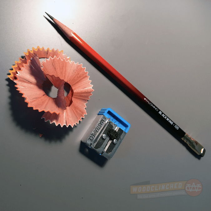
I noticed, both in the promotional picture and on the pencils I’ve used, that the gradated lacquer seems to be a topcoat on a white pencil. Notice the thing white line on the border of where the paint meets the tip:

I’m not entirely sure why this is here — I have a few theories:

  • Perhaps they just painted over a Blackwing Pearl, since the core seems to be the same or similar. I doubt this, though.
  • Because of the large minimums they must need from the manufacturer to place an order, the Volumes editions are a series of blanks that are basically a fully formed Palomino but with a plain white barrel, sort of like primer coat of paint that’s laid down when you’re painting a wall. If their Blackwings came like this from the manufacturer with cores from the same three varieties, all they’d have to do is apply a topcoat of lacquer, stamp a custom name/model number on, and ship it.
  • That yellow at the tip is so bright and vibrant that they needed a white base layer in order to make it shine.

I’m leaning toward the second one, from a matter of economics and practicality from Palomino’s standpoint, but I am not sure.

In his review of the 725, Pencil Revolution editor (and my good friend and podcast co-host) Johnny Gamber said something really interesting about how they fit into the product lineup:

Also, this is the first truly glossy Blackwing I have ever seen. The MMX is matte; the 602 is metallic; the Pearl is, well, opalescent. The 725 reminds me of the finish on an instrument, which is, of course, what they were going for.

Presentation matters

The thing I was most impressed with was the amazing presentation of these pencils. They came in a thick, matte black box with a simple “Blackwing” subtly debossed on the top.

If you buy a dozen of 725 from a retailer, it comes with a really beautiful sleeve over the box with a picture of the pencil, and text pressed into the thick cardstock. I managed to score one of these sleeves, and I recommended to Palomino that in future editions, they give those sleeves to subscribers, too. It really adds to the aesthetic value of the box.

They say packaging doesn’t matter, but to someone like me who appreciates really nicely designed products, it really makes a difference.

Subscribers also get a thirteenth “archival” pencil; all sealed in a tube with a label on it documenting the edition. The plastic tube it comes in has a rubberized cap on both ends, and while you can easily unseal it, it should stay pretty airtight to preserve your eraser for years and years.

Performance matters too, but not as much in this case

In my last post announcing the Volumes program, I was wondering (well, hoping) that they were going to reformulate the pencil for each edition. I don’t believe that they did that. And I guess I understand why not; it’s a giant pain in the butt to birth a new graphite formulation — lots of iterating, lots of research and development, and lots of communication between parties.

And to do that every three months? I can’t imagine a giant pencil company like Staedtler or Tombow doing that, let alone a tiny company like Palomino.

When Palomino announced this pencil, they referred to the graphite core as “Balanced”. That seemed to me to send a clear message that this would be based on the Palomino Pearl pencil, which bears the description “Balanced and Smooth” on the box (as opposed to the Blackwing MMX’s “Soft and Smooth” and the 602’s “Firm and Smooth”).

When I tried it out, it wrote very much like the Pearl. Which I appreciated — the Pearl is a damn fine pencil. So much so, I’m guessing that the 725 has an identical core to the Pearl.

I won’t retrace my steps here, so check out my original Pearl review from about two years ago. I think the performance section of the review holds true for this pencil, too.

Concluding

If you’re on the fence about a Blackwing Volumes subscription, I understand. $111 (including shipping) is a lot to pay for four dozen pencils. But, it’s not particularly more than if you were to buy four dozen Palominos straight off the website, and the presentation is just so good. As Johnny mentioned, it feels like Palomino spent a lot more on packaging and shipping than subscribers paid for.

Check out the Palomino Blackwing 725 product page to purchase a boxed dozen of them for $24.95, or to subscribe for a year for $99.