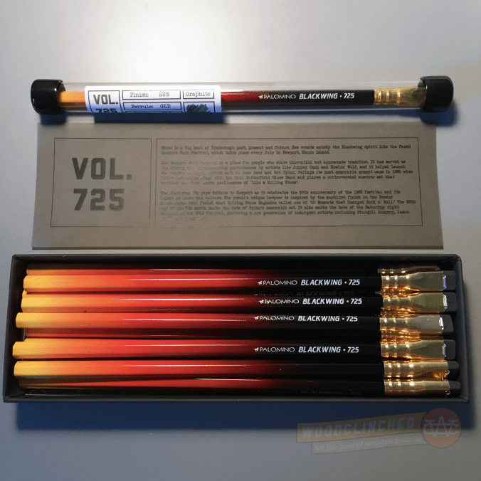
Yesterday was a big day! After I got home from a design lecture at Facebook (featuring Aaron Draplin!), there was a package waiting for me. It was just a plain, padded manila envelope, but the big words at the top of it made me so excited: “PALOMINO.” My first Blackwing Volumes subscription had arrived!
NUMB3R5
Last week, Palomino teased the edition through social media with a tiny nugget about the edition. It was simply a three-digit number: 725.
I posted in the Erasable group with some of my theories about what that number means. Most of my ideas centered around the idea of “725” being a model number, like how the Eberhard Faber Blackwing was “602.” Thanks to Bob Truby’s amazing site Brand Name Pencils and a quick search for “725,” I came up with a few great pencils:
- The Ruwe Ritz 725
- The General’s Kimberely Copying pencil
- The Eberhard Faber Sapphire Indelible pencil
Wouldn’t it have been fun if the Blackwing was sapphire blue like the EF Sapphire?
It’s all right, though. The actual reason for the 725 is much more interesting and true-to-brand for Palomino and their arts and music-centric interests.
A Pencil inspired by a guitar
Here’s why this sunbursted pencil bears the number 725, according to product page on the Blackwing website:
The Blackwing 725 pays tribute to Newport as it celebrates the 50th anniversary of the 1965 festival and its impact on music and culture. The pencil’s unique lacquer is inspired by the sunburst finish on the Fender Stratocaster that fueled what Rolling Stone Magazine called one of “50 Moments that Changed Rock n’ Roll.” The 25th day of the 7th month marks the date of Dylan’s memorable set.
It makes good sense. I don’t think I’ve ever seen a Stratocaster in person, or if I have, I didn’t notice, but after some image-searching on Google, it’s a great intepretation:
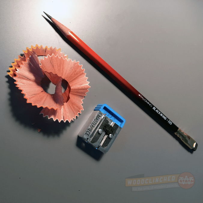
Even on its own, the integrity of the 725 holds up. The lacquer that gradates from black near the eraser, to glowing yellow at the tip is really unique and lovely. I have no idea how the process happened, but in looking closely at it, the color is not halftoned or pixelated, so it seems like maybe it wasn’t just printed onto the barrel.
I noticed, both in the promotional picture and on the pencils I’ve used, that the gradated lacquer seems to be a topcoat on a white pencil. Notice the thing white line on the border of where the paint meets the tip:
I’m not entirely sure why this is here — I have a few theories:
- Perhaps they just painted over a Blackwing Pearl, since the core seems to be the same or similar. I doubt this, though.
- Because of the large minimums they must need from the manufacturer to place an order, the Volumes editions are a series of blanks that are basically a fully formed Palomino but with a plain white barrel, sort of like primer coat of paint that’s laid down when you’re painting a wall. If their Blackwings came like this from the manufacturer with cores from the same three varieties, all they’d have to do is apply a topcoat of lacquer, stamp a custom name/model number on, and ship it.
- That yellow at the tip is so bright and vibrant that they needed a white base layer in order to make it shine.
I’m leaning toward the second one, from a matter of economics and practicality from Palomino’s standpoint, but I am not sure.
In his review of the 725, Pencil Revolution editor (and my good friend and podcast co-host) Johnny Gamber said something really interesting about how they fit into the product lineup:
Also, this is the first truly glossy Blackwing I have ever seen. The MMX is matte; the 602 is metallic; the Pearl is, well, opalescent. The 725 reminds me of the finish on an instrument, which is, of course, what they were going for.
Presentation matters
The thing I was most impressed with was the amazing presentation of these pencils. They came in a thick, matte black box with a simple “Blackwing” subtly debossed on the top.
If you buy a dozen of 725 from a retailer, it comes with a really beautiful sleeve over the box with a picture of the pencil, and text pressed into the thick cardstock. I managed to score one of these sleeves, and I recommended to Palomino that in future editions, they give those sleeves to subscribers, too. It really adds to the aesthetic value of the box.
They say packaging doesn’t matter, but to someone like me who appreciates really nicely designed products, it really makes a difference.
Subscribers also get a thirteenth “archival” pencil; all sealed in a tube with a label on it documenting the edition. The plastic tube it comes in has a rubberized cap on both ends, and while you can easily unseal it, it should stay pretty airtight to preserve your eraser for years and years.
Performance matters too, but not as much in this case
In my last post announcing the Volumes program, I was wondering (well, hoping) that they were going to reformulate the pencil for each edition. I don’t believe that they did that. And I guess I understand why not; it’s a giant pain in the butt to birth a new graphite formulation — lots of iterating, lots of research and development, and lots of communication between parties.
And to do that every three months? I can’t imagine a giant pencil company like Staedtler or Tombow doing that, let alone a tiny company like Palomino.
When Palomino announced this pencil, they referred to the graphite core as “Balanced”. That seemed to me to send a clear message that this would be based on the Palomino Pearl pencil, which bears the description “Balanced and Smooth” on the box (as opposed to the Blackwing MMX’s “Soft and Smooth” and the 602’s “Firm and Smooth”).
When I tried it out, it wrote very much like the Pearl. Which I appreciated — the Pearl is a damn fine pencil. So much so, I’m guessing that the 725 has an identical core to the Pearl.
I won’t retrace my steps here, so check out my original Pearl review from about two years ago. I think the performance section of the review holds true for this pencil, too.
Concluding
If you’re on the fence about a Blackwing Volumes subscription, I understand. $111 (including shipping) is a lot to pay for four dozen pencils. But, it’s not particularly more than if you were to buy four dozen Palominos straight off the website, and the presentation is just so good. As Johnny mentioned, it feels like Palomino spent a lot more on packaging and shipping than subscribers paid for.
Check out the Palomino Blackwing 725 product page to purchase a boxed dozen of them for $24.95, or to subscribe for a year for $99.


Great review, sir! If you have, ahem, back-channels wherein one might score one of those sleeves, ahem, this guy might make it worth your while…
You’re definitely right about including them for subs in the future though.
Completely agree regarding the sleeves. They’re nice! Dagnabit, if anyone deserves the sleeves it’s those who dove in headfirst without checking the depth first. We need to discover the location of the secret pencil sleeves warehouse.
Pingback: Blackwing 725.
When I saw your last post about the subscription, I immediately forwarded it to my husband. He was less than thrilled with the price tag. 😐 When he asked why I would need these pencils, when I do everything on my laptop, I could only come up with, “I would take notes with them!” and “They will be the best pencils EVER!” It didn’t work.As a lefty, I ONLY use pencil! He’s even a lefty! Sigh. I envy yours.
Andy, it’s pretty standard to lay down a coat of white under yellow and/or orange paint. It provides depth to the finish.
AW – Not sure if Blackwing/Pencils.com/CalCedar were thinking this, but the white undercoat is very appropriate if going for the vintage sunburst Fender finish. Prior to the mid 60s most Fender (and other) guitars and basses were Nitrocellulose finished – which required a white primer. If you see vintage relic’d instruments, you will see the finish wear away to white then to wood. If they were not thinking this, its just a happy coincidence.
That’s fascinating! And good to know Palomino could have just been sweating the details. 😀